Toolbox
The Toolbox pane contains a list of the container and user interface controls that can be dragged and dropped onto the Design Sheet.
Each control has a default name, but can be renamed by right-clicking on a control and using the shortcut menu.
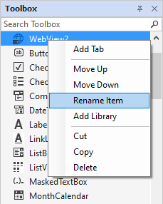
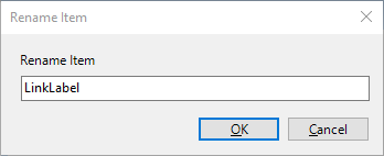
Selecting Rename Item will open the Rename Item form, from which you can modify the name of the control and click OK.
Controls can also be ordered from the shortcut menu using the Move Up and Move Down options.
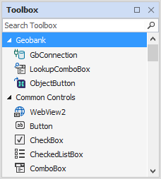
Geobank
The Geobank section of the Toolbox contains controls for incorporating Micromine Geobank functionality within a Flow, where possible.
| Control | Description |
|---|---|
| GbConnection |
The GbConnection control provides a DataSource connection to the current Geobank database to which Flow Designer is connected. The control properties determine any required data bindings. |
| LookupComboBox |
The LookupComboBox control is used for columns with lookup validation rules so that a drop-down is automatically set up in a Combobox, making the correct list of codes available for the user to select from. |
| ObjectButton |
The ObjectButton control creates a button that can be used to initiate any Micromine Geobank process - for example, running a data view. |
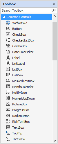
Common Controls
The Common Controls section of the Toolbox contains commonly used controls such as buttons, check boxes and text boxes.
| Control | Description |
|---|---|
|
The WebView2 control allows you to host a web browser, including the option for navigation controls, within your applicaton. |
|
|
The Button control is used to trigger an action (for example, open a Micromine Geobank object or execute a process) when clicked on by the user. |
|
|
The CheckBox control allows the user to toggle an option on or off, usually reflecting a Boolean (Yes/No or True/False) value. When they are presented as a list of options, any combination of check boxes may be selected or de-selected. |
|
|
The CheckedListBox control allows the user to toggle an option on or off in a specified list of items. The CheckedListBox control presents designers with a dialog to enter the list of items to contain a Boolean check box - one item per line. The control only supports the selection of one item or none. |
|
|
The ComboBox control provides a drop-down version of the ListBox control, allowing for the selection from multiple, contiguous or non-contiguous items in a list. Since a ComboBox takes up less space than a fully exposed list of items, the use of a ComboBox is often preferred. |
|
|
The DateTimePicker control allows the user to pick a time or date value using an editable field to set the Time, or a calendar selector for the Month, Day, and Year components. If an object opened in a form has configured substitution parameters, the This is necessary for parameter values to be successfully passed to other (query, import, export, data view, report, application, drillhole utility, coal utility) objects. |
|
|
The Label control allows you to put a short line of text on the screen. A TextBlock is preferred for multiple lines of text. Unlike a TextBlock, which is text-only, the Label control has a Content property which lets it host any kind of control (usually an image). |
|
|
The LinkLabel control allows you to add a short line of text on the form, as well as select all or part of the text to create a hyperlink to a web page or an object in the project. |
|
|
The ListBox control allows the selection of multiple, contiguous or non-contiguous items in a list. |
|
|
The ListView control is used to represent lists of data. A common use of the ListView is to show a list of files and associated (size, creation and modification dates, etc.) metadata columns in Windows Explorer. ListView items can be displayed in standard Explorer styles - e.g. Large Icons. |
|
|
The MaskedTextBox control allows you to create a text box with a definable input mask. When you configure an input mask, you can specify the allowable user input; and no custom validation logic is required. The input mask will ensure that the text entered by a user is in a valid format. For example, password inputs can be designated a specific number of characters in a defined format. |
|
| MonthCalendar |
The MonthCalendar control allows a user to pick a date using a visual calendar display. |
|
The NotifyIcon control enables the placement of a notification icon on the form in the Notification area. You can select the specific icon to display using the control properties. |
|
|
The NumericUpDown control places an up-down control (sometimes known as a 'spin box'), displaying numeric values that a user can navigate through to set. Minimum and maximum numbers in the available range are configured from the properties for the control. |
|
|
The PictureBox control allows you to display an image in one of several (BMP, GIF, ICO, JPEG, PNG) image file formats. The control also allows you to configure the display of the image within the box - with options such as Zoom and Centre. |
|
|
The ProgressBar control provides a visual indication of progress in an operation such as downloading a file. The progress is defined by setting a minimum and maximum value and then incrementing a progress counter value. |
|
|
The RadioButton control allows the user to select one (and only one) option from a list of options. While the same thing can be done using a ComboBox, RadioButtons provides an immediate view of all the available options. |
|
|
The RichTextBox control provides a Text Editor for rich (formatted) text. Font styles and Paragraph formatting are supported. To enter or edit a single line, or multiple lines of plain text, use the TextBox control instead. |
|
|
The TextBox control is a very basic text-input control which allows the user to enter a single line |
|
| ToolTip |
The ToolTip control is used to enter text that will be displayed when a user hovers on a control. Tool tips can be associated with any control. |
|
The TreeView control allows hierarchical data to be displayed as nodes and sub-nodes in a "tree-like" structure. In Windows Explorer, for example, a TreeView is used to show the folders and subfolders on the drives of your computer. |
|
Data
The Data section of the Toolbox contains controls that can be used to configure and utilise the datasets for the flow.
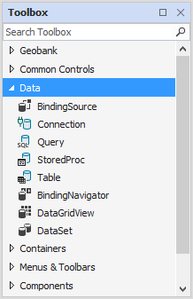
| Control | Description |
|---|---|
| Binding Source |
The BindingSource control specifies the data source for a form from the DataSet instances for the project. BindingSource simplifies associating data with controls on a form. It can often be paired with a BindingNavigator. |
| Connection |
The Connection control specifies a connection to an application, server, or site. The control properties determine the source database name and other parameters needed to establish the initial connection; as well as any required data bindings. |
| Query |
The Query control is used to perform SQL data commands on the data configured for the DataSet and Connection controls. Delete, Insert, Select and Update commands can be configured for data in your project. |
| StoredProc |
The StoredProc control is used to create a stored procedure script that can be performed against the storage tier against a document collection. |
| Table |
The Table control is used to query a specified table in the data for your project. The TableName, Connection and DataSet settings are configured in the control properties. |
| Binding Navigator |
The BindingNavigation control presents a navigation user interface for controls on a form that are bound to data. BindingNavigation provides a standardised way to navigate and interact with data on a form. A BindingNavigation control is usually paired with a BindingSource set to the associated data to move through records on a form and view/edit them. |
|
The DataGridView control allows you to interact with and edit the rows and columns of a Dataset in a customisable grid. The DataGridView includes built-in column types and a template column for hosting custom content. The built-in row type includes a drop-down details section that you can use to display additional content below the cell values. |
|
| DataSet |
An in-memory cache of data retrieved from a data source, the DataSet control is a collection of DataTable objects that can be related to each other. |
See: Working with Data
Containers
The Containers section of the Toolbox contains container controls that can be used to group and place sections of your flow.
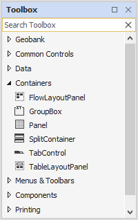
| Control | Description |
|---|---|
|
The FlowLayoutPanel is a container that dynamically lays out contents in the Flow Designer horizontally or vertically. Contents can be wrapped from one row or column to the next within the panel. The contents within can be either clipped or wrapped in the container. |
|
|
The GroupBox control is a container commonly used to group other user interface controls (i.e. CheckBoxes, Radio buttons, ComboBoxes, etc.) under a heading and within a border. |
|
|
A Panel container is used to contain other controls. You can set up a Panel to contain a collection of related controls, making it easy to dock content at the Top, Bottom, Left and Right of a form. This makes it ideal when you want to divide the form into specific areas. |
|
|
The |
|
|
The tabs of a TabControl are usually placed at the top of a form to provide multiple tabs for page navigation; however, tabs may also be placed at the Bottom, Left and Right of a form. Each TabControl consists of multiple TabPage objects that share the same screen space, with only one tab visible at a time. |
|
|
The TableLayoutPanel is a panel that dynamically lays out selected contents in a grid composed of rows and columns. |
See: Containers
Menus & Toolbars
The Menus & Toolbars section of the Toolbox contains menu and toolbar controls that can be added to the flow.
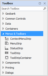
| Control | Description |
|---|---|
| ContextMenuStrip |
The ContextMenuStrip control is used to provide a right click shortcut menu that can be associated with any control. For example, you can associate a shortcut menu with a control to provide functions not supported by standard ShortcutsEnabled property. |
| Menu Strip |
The MenuStrip control is a top-level container allowing a range of options to be provided in a menu structure on a form, using very little space. Items can be added to the control to represent menu commands for the application, or contain a range of sub-items, allowing for the creation of a hierarchical menu structure. |
| StatusStrip |
The StatusStrip control represents a status bar and is usually added at the bottom of a form and can be divided into several areas of information about the current state of application processes, the current cursor position, word counts, etc. |
| Tool Strip |
The ToolStrip control is used to create a common framework for toolbars, status bars, and menus to combine tools and options. ToolStrip controls support advanced user interface and layout features, such as docking, buttons with text and images, and drop-down options. |
| Tool Strip Container |
The ToolStripContainer control provides four docked panels on each side of the form and a central panel that can hold one or more controls. The panels can contain one or more ToolStrip, MenuStrip or StatusStrip controls. Panels can not be removed, but can be hidden in the properties for the control. |
See: Menus & Toolbars
Components
The Components section of the Toolbox contains flow components such as Event Log, Message Queue and Processes.
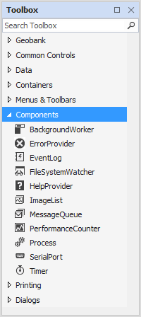
| Control | Description |
|---|---|
| BackgroundWorker |
The BackgroundWorker component executes an operation on a separate, dedicated thread. Operations like downloads and database transactions that take time can cause your user interface to appear unresponsive. The BackgroundWorker component will execute a time-consuming operation in the background, listen for events that report the progress of your operation and signal when your operation is finished - without an unresponsive user interface. |
| ErrorProvider |
The ErrorProvider component provides indication that a control on a form has an associated error. An error description and an associated icon can be configured for the component to 'flash' in a configurable BlinkStyle and BlinkRate. A ToolTip can also be configured to display the error description when a user hovers over the icon. |
| EventLog |
The EventLog component provides interaction with Windows® event logs which record information about important software or hardware events. The component lets you read existing logs, write entries to logs, create or delete event sources, delete logs, and respond to log entries. New logs can also be created when creating an event source. |
| FileSystemWatcher |
The FileSystemWatcher component monitors the file system notifications and raises a notification event when a directory, or file in a directory, changes. You can use a FileSystemWatcher to look for changes in files or subdirectories in a specified directory on a local computer, network drive or remote computer. |
| HelpProvider |
The HelpProvider component provides pop-up or online Help for controls on a form. The component instance has a collection of references to controls associated with it. The HelpNamespace property associates a Help file with a HelpProvider. |
| ImageList |
The ImageList component is used to manage a collection of images. ImageList can be used by controls such as a ListView to select the icons and other images required for display. |
| MessageQueue |
The MessageQueue component provides access to a queue on a Message Queuing server. Applications can communicate across networks and systems to send, receive, or read (peek) messages from queues. A path to an existing resource can be set in the MessageQueue, or a new queue can be created. |
| PerformanceCounter |
The PerformanceCounter component provides an instance of a Windows NT performance counter. The component can be used for reading predefined or custom counters and publishing (writing) performance data to custom counters. Performance that can be data collected includes busy time for a processor, memory usage, or the size of data (in bytes) received over a network. |
| Process |
The Process component provides access to local and remote processes and can be used to start and stop local system processes. The Process component can provide a list of the processes that are running, or a new process can be initiated. |
| SerialPort |
The SerialPort component is used to control a serial port file resource. The component provides synchronous and event-driven I/O, access to pin and break states, and access to serial driver properties. |
| Timer |
The Timer component generates an event after a set interval, with an option to generate recurring events. The server-based component raises an Elapsed event in your application, once or repeatedly, after the number of milliseconds specified in the Interval property have passed. |
See: Components
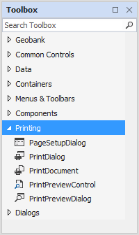
Printing
The Printing section of the Toolbox contains controls for adding print functions to the flow - such as Page Setup and Preview.
| Control | Description |
|---|---|
| Page Setup Dialog |
The PageSetupDialog printing control provides a dialog allowing a user to manipulate printing and margins; paper orientation, size, and source; as well as show Help and network buttons. |
| Print Dialog |
The PrintDialog component provides a standard print dialog box that configures the print job and queue according to input from the user and then prints a document. |
|
The PrintDocument component configures an object that can be reused that sends output to a printer, when printing from a form. |
|
| Print Preview Control |
The PrintPreviewControl component provides the preview component of print previewing from a form, without any dialogs or buttons. PrintPreviewControl components are usually contained in PrintPreviewDialog components, but this is not a mandatory requirement. |
| Print Preview Dialog |
The PrintPreviewDialog component provides a dialog that usually contains a PrintPreviewControl for printing from a form. Unlike PrintPreviewControl components, buttons and other dialogs are included in the PrintPreviewDialog. |
The Dialogs section of the Toolbox contains dialog controls that can be added to the flow, such as Open File and Save File dialogs.
See: Printing
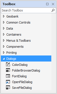
Dialogs
| Control | Description |
|---|---|
| ColorDialog |
The ColorDialog control provides a common dialog box displaying the available colours, along with controls for the user to define custom colours. |
| FolderBrowserDialog |
The FolderBrowserDialog control provides the user with a prompt to browse, create, and eventually select a folder. This control is not used for selecting files. |
|
The FontDialog control provides a dialog that prompts the user to select a font from those installed on the local computer. |
|
| OpenFileDialog |
The OpenFileDialog provides a dialog that prompts the user to select and open a file. |
| SaveFileDialog |
The SaveFileDialog component provides a dialog that prompts the user to select a location for saving a file. |
See: Dialogs