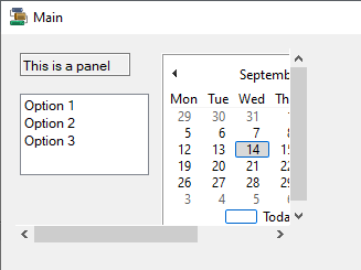
Panel
A Panel container is used to contain other controls. You can set up a Panel to contain a collection of related controls, making it easy to dock content at the Top, Bottom, Left and Right of a form. This makes it ideal when you want to divide the form into specific areas.
The Panel container control will position the controls within it based on the properties you apply and can be configured to display a scrollbar when the size of the container is too small to display all controls.
Properties
The key properties of a Panel container include:
-
AutoScroll. Determines whether to enable scroll bars when the Panel contains controls outside the visible size.
-
BorderStyle. By default, the Panel container is displayed without borders. You can select a BorderStyle to add borders which visually separate the Panel in the form.
-
Enabled. Determines whether the Panel container is active on the form. If you set the Enabled property to 'False', the panel is inactive along with all of the controls it contains.
Events
Events can be configured for the Panel to specify the behaviour of the control. For example, an action can be triggered using the Click property.
For information on configuring events and other components of the design using a script, see: Working with Scripts.
Adding a Panel
When you drag a Panel container control to a form in the Flow Designer, it will be given a default name and you can resize and move it in the form with the controls provided.
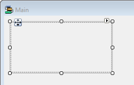
The name can be modified and the appearance, behaviour and layout of the Panel container configured in the Properties pane.
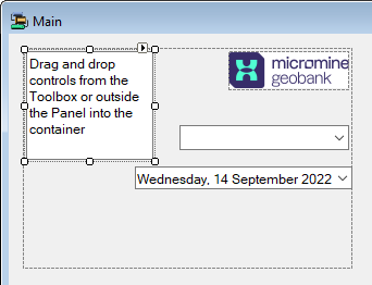
Drag and drop the controls you want to appear in the container from the Toolbox into the Panel on the form.
Information on the properties and events for the Panel container control can be viewed at the link to Microsoft® Documentation.