MaskedTextBox
The MaskedTextBox control allows you to create a text box with a definable input mask. When you configure an input mask, you can specify the allowable user input; and no custom validation logic is required. The input mask will ensure that the text entered by a user is in a valid format. For example, password inputs can be designated a specific number of characters in a defined format.
Properties
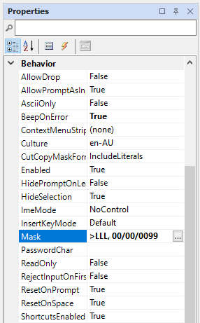
The Mask property is the key property for the MaskedTextBox. You can use the property to configure an input mask.
Events
The key events for the MaskedTextBox control include:
-
Click. Sets what occurs when the text box is clicked.
-
MaskInputRejected. Sets what occurs when the input added by the user does not match the rules of the input mask.
For information on configuring events and other components of the design using a script, see: Working with Scripts.
Adding a MaskedTextBox
When you drag a MaskedTextBox control to a form, use the control properties to select the Set Mask option.
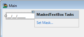
This will open the Input Mask form which you can use to configure the input mask for your MaskedTextBox.
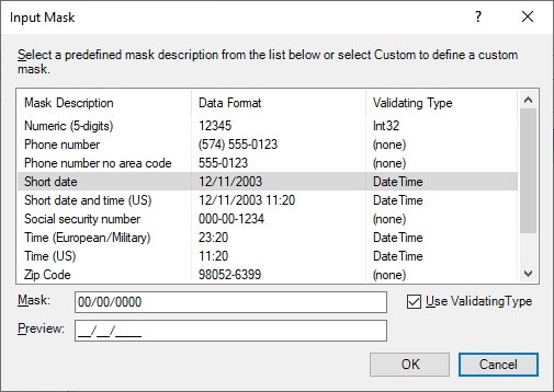
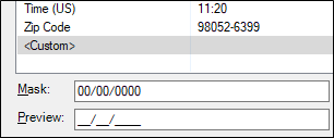
The Input Mask form contains a list of predefined input masks that can be used to mask the text box on your form. You can select the Custom option to define the input required from the user.
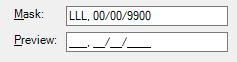
Use the Mask field to enter the input mask format. For example, LLL, 00/00/9900 would indicate that the first three characters are compulsory and must be ASCII letters a-z or A-Z; the 00/00 characters are compulsory numerical digits; and the 9900 segment means only the last two digits are compulsory numeric, while the first two (99) are optional, numeric. The forward-slashes throughout are hard-coded to appear.
Note: you can force the ASCII letters entered to display as upper case using the > character for the Shift Up command - e.g. >LLL would display three capital letters, such as TUE.
A list of the masking elements that can be used to create your input format can be found at the link to Microsoft® Documentation.
A preview of the required input format appears in the Preview field.
If you select the Use Validation Type option for the input mask, the data type entered by the user will be verified against the data type configured for the validation. For example, if the DateTime data type is used, and the user does not input a date time value, a validation error will be triggered.