Binding Navigator
The BindingNavigation control presents a navigation user interface for controls on a form that are bound to data. BindingNavigation provides a standardised way to navigate and interact with data on a form. A BindingNavigation control is usually paired with a BindingSource set to the associated data to move through records on a form and view/edit them.
Although a BindingNavigator control can be bound to any data source, it was designed to integrate with a BindingSource through the BindingNavigator.BindingSource property.
Properties
Key properties of the BindingNavigator control include:
-
DataBindings. Using the DataBindings properties for the control, you can bind data such as database table to the BindingNavigator.
-
Items. Specifies the items that have been added to the BindingNavigator control.
Events
Events can be configured for the BindingNavigator to specify behaviour for the Data element. For example, an action can be triggered using the Click property.
For information on configuring events and other components of the design using a script, see: Working with Scripts.
Adding a BindingNavigator
When you drag a BindingNavigator control to a form in the Flow Designer, a control will appear in the design space, and the navigator will appear at the top of the active form. You can use the control properties to configure the RenderMode, Dock and GripStyle settings for the navigator, as well as Insert Standard Items and Edit Items.
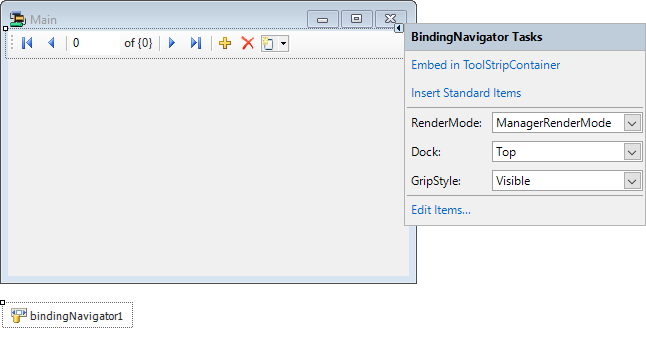
These options are also available below the Properties panel for the control.
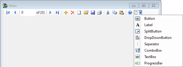
If you click the Insert Standard Items option, the BindingNavigator control will be populated with a collection of common menu items:
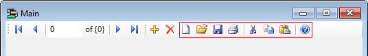
These standard items, once added, can be edited or removed as required.
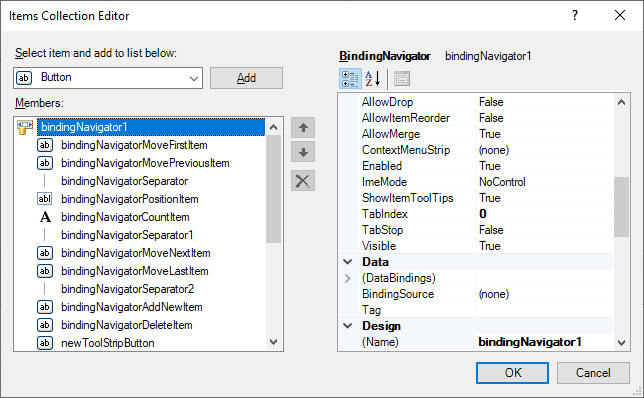
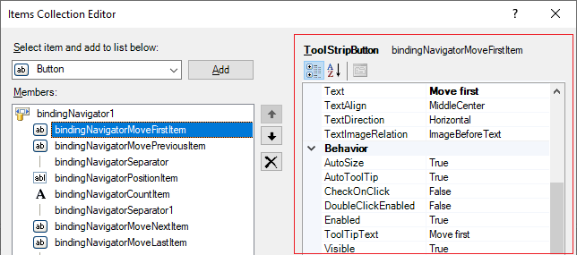
The Edit Items... option opens the Items Collection Editor form from which you can create and configure the menu items for your control.
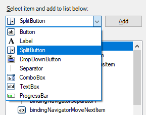
Use the drop down at the top of the Items Collection Editor to select which item type you want to add and configure. For example, select the SplitButton option to add, delete and configure the
You can add an instance of the selected item using the Add button at the right of the drop down list. This will add a new item to the bottom of the list in the panel at the left. You can change the order of the items in the list using the Up and Down buttons. Items can be removed from the list using the Delete button.
For each item on the menu control list, you can set the item properties, while it is selected, using the Properties pane on the right of the Items Collection Editor.
You can also add menu items using the drop-down that is activated when the BindingNavigator strip is selected.
Information on the properties for various menu items can be found by searching for the item name on the Forms Help at Microsoft® Documentation. For example, information on ToolStripSplitButton can be found via the link.
When you have configured the control as required, click OK to return to the form.
Information on the properties and events for the BindingNavigator control can be viewed at the link to Microsoft® Documentation.