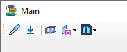
Tool Strip
The ToolStrip control is used to create a common framework for toolbars, status bars, and menus to combine tools and options. ToolStrip controls support advanced user interface and layout features, such as docking, buttons with text and images, and drop-down options.
Items such as buttons, combo boxes, text box and labels can be contained within a ToolStrip control. The control manages the display and user input, including drag and drop input, for the items. The items control the layout of and events for their individual function.
Properties
Key properties for the ToolStrip control include:
-
Enabled. Determines whether the ToolStrip is active. If you set the Enabled property to 'False', the items on the ToolStrip are displayed as inactive.
-
Items. Specifies the items that have been added to the ToolStrip control.
Events
Events can be configured for the ToolStrip to specify the behaviour of the control. For example, an action can be triggered when a user clicks the control using the Click property.
For information on configuring events and other components of the design using a script, see: Working with Scripts.
Adding a ToolStrip
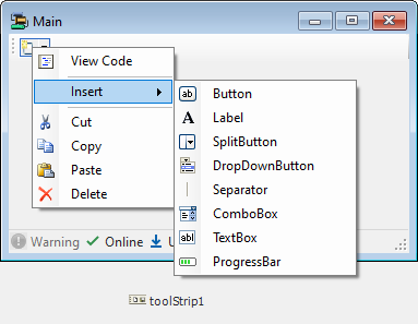
When you drag a ToolStrip control to a form in Flow Designer, it will appear in the design space, and the menu will be displayed at the top of the active form (by default). You can use the drop down menu for the item button to Insert items for your ToolStrip.
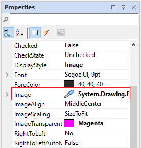
When added to your ToolStrip, you can configure a selected item using the Properties pane. For example, if you insert a Button control, you can select the image for the button from the Image property.
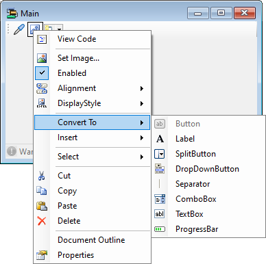
You can also configure each item using the right click shortcut menu. Items can also be converted to other elements using the Convert To shortcut option.
Alternatively, select the ToolStrip in the form and use the control properties to set the RenderMode, Dock and GripStyle options and then select Edit Items....
The Edit Items... option opens the Items Collection Editor form from which you can create and configure the menu items for your control.
Use the drop down at the top of the Items Collection Editor to select which item type you want to add and configure. For example, select the SplitButton option to add, delete and configure the
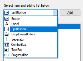
You can add an instance of the selected item using the Add button at the right of the drop down list. This will add a new item to the bottom of the list in the panel at the left. You can change the order of the items in the list using the Up and Down buttons. Items can be removed from the list using the Delete button.
For each item on the menu control list, you can set the item properties, while it is selected, using the Properties pane on the right of the Items Collection Editor.
Information on the properties for various menu items can be found by searching for the item name on the Forms Help at Microsoft® Documentation. For example, information on ToolStripSplitButton can be found via the link.
When you have configured the control as required, click OK to return to the form.
Information on the properties and events for the ToolStrip control can be viewed at the link to Microsoft® Documentation.