CheckedListBox
The CheckedListBox control allows the user to toggle an option on or off in a specified list of items. The CheckedListBox control presents designers with a dialog to enter the list of items to contain a Boolean check box - one item per line. The control only supports the selection of one item or none.
Properties
Key properties of CheckedListBox include:
- Content. The text for items added to the list displayed for each Check Box.
- CheckOnClick. Determines if the check box should be selected on the first click of an item.
- MultiColumn. Whether the values in the list should be displayed horizontally in columns.
- SelectionMode. Determines if the list box is single-select, multi-select or not selectable.
- DataBindings. Using the DataBindings properties for the control, you can bind data such as database table to the CheckedListBox.
Events
Events can be configured for the CheckedListBox to specify the behaviour of the control. For example, an action can be triggered using the Click property.
For information on configuring events and other components of the design using a script, see: Working with Scripts.
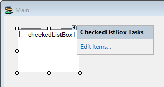
Adding a CheckedListBox
When you add a CheckedListBox control to a form, click the control properties to Edit Items...
This will open the String Collection Editor in which you can add items to your list - one item per line.
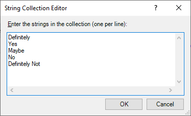
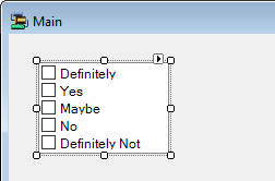
When your items are added as required, click OK to add the checked box list to your form.
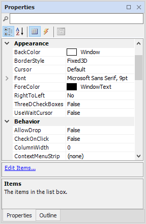
You can use the Properties pane to configure the Text and other required properties for items in the CheckListBox.
Information on the Properties and Events for the CheckedListBox control can be found at the link to Microsoft® Documentation.