CheckBox
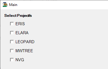
The CheckBox control allows the user to toggle an option on or off, usually reflecting a Boolean (Yes/No or True/False) value. When they are presented as a list of options, any combination of check boxes may be selected or de-selected.
Properties
Key properties of the CheckBox control include:
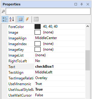
- Text. The prompt displayed alongside the CheckBox.
- Checked. The default state, and subsequent states, of a CheckBox can be set to True(checked) or False (unchecked).
- Image. An image can be added to the CheckBox and displayed aligned relative to the Text.
-
ThreeState. If the ThreeState property is set to True, the CheckBox will be considered checked if it is either checked or in an undetermined state.
Events
Events can be configured for the CheckBox to specify the behaviour of the control. For example, an action can be triggered using the Click property.
For information on configuring events and other components of the design using a script, see: Working with Scripts.
Adding a CheckBox
When you drag a CheckBox control to a form in the Flow Designer, it will be given a default name and you can move and resize the control using the mouse.
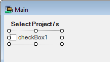
Use the Properties pane to configure the Text and other required properties for the CheckBox.
Information on the Properties and Events for the CheckBox control can be found at the link to Microsoft® Documentation.