GroupBox
The GroupBox control is a container commonly used to group other user interface controls (i.e. CheckBoxes, Radio buttons, ComboBoxes, etc.) under a heading and within a border.
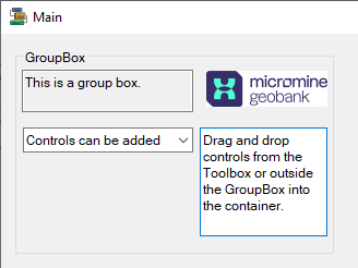
The GroupBox container is a convenient way to divide a form into related controls based on functionality. Adding related controls to a GroupBox lets users see a particular set of functionality at a glance. During the design or redesign process, the GroupBox can be moved easily, along with all of the controls it contains.
Properties
Key properties for the GroupBox container include:
-
AutoSize. Determines whether the GroupBox container is automatically resized based on the controls it contains.
-
AutoSizeMode.Determines the behaviour of the AutoSize property when it is set for the GroupBox.
-
FlatStyle. Lets you select the flat style to determine the appearance of the displayed GroupBox container.
Events
Events can be configured for the GroupBox to specify the behaviour of the control. For example, an action can be configured to occur when a user hovers the mouse over the Group Box using the MouseHover event property.
For information on configuring events and other components of the design using a script, see: Working with Scripts.
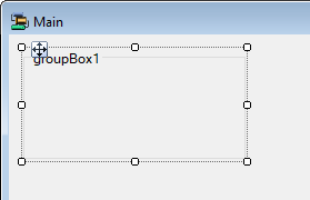
Adding a GroupBox
When you drag a GroupBox container control to a form in Flow Designer, it will be given a default name and you can resize and move it in the form with the controls provided.
The appearance, behaviour and layout of the GroupBox container can be configured in the Properties pane.
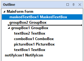
Drag and drop the controls you want to appear in the container from the Toolbox into the GroupBox on the form. You can also drag the entry for the control in the Outline pane to the entry for the GroupBox to move it inside the container.
Information on the properties and events for the GroupBox container control can be viewed at the link to Microsoft® Documentation.