ToolTip
The ToolTip control is used to enter text that will be displayed when a user hovers on a control. Tool tips can be associated with any control.
Properties
The key properties of a ToolTip control include:
-
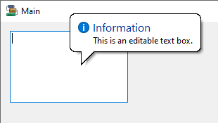
IsBalloon. Whether the tool tip style is balloon (as shown in the above screen).
-
ShowAlways. Whether the configured tool tip is always displayed, or only when the user hovers on the control. The above screen is displayed with the Info icon.
-
ToolTipIcon. Determines the icon, if any, to be used for the tool tip.
-
ToolTipTitle. The title of the tool tip - which is 'Information' in the above screen.
For the control/s with which you associate the ToolTip, the text of the tip is created in the ToolTip on [tooltip name] property. For example, the TextBox control properties:
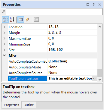
The ToolTip on [tooltip name] property is not enabled for other controls unless a ToolTip control has been dragged to the form. The tooltip can then be associated with multiple controls.
Events
Events can be configured for the ToolTip to specify the behaviour of the control. For example, an action can be triggered when the tool tip pops up, using the PopUp event property.
For information on configuring events and other components of the design using a script, see: Working with Scripts.
Adding a ToolTip
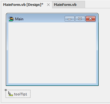
When you drag a ToolTip control to a form, it will be assigned a default name and appear under the form at the bottom of the Flow Designer.
The name, appearance and other settings for the ToolTip control can be configured using the Properties pane. Once configured, the tool tip can be associated with any control/s.
Information on the properties and events for the ToolTip control is available at the link to Microsoft® Documentation.