Chart | Boundary Analysis
The binned data is displayed on a symmetric chart layout with one domain facing left and the other facing right. The domains are separated at the contact, which appears as a vertical line in the centre of the chart.
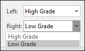
Drop-down lists in the chart toolbar provide quick changes when multiple domains share the contact.
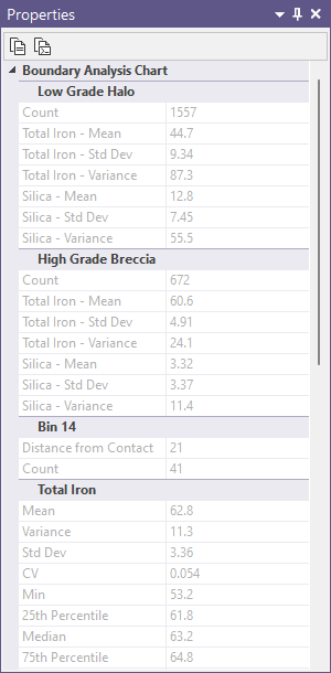
Grade trends are shown as trendlines of average grade versus distance from the contact, and summary statistics are shown in the Properties window.
The nature of the contact is revealed by comparing the grade trends across the contact.
A large grade discontinuity indicates a hard or sharp boundary, and a small or no discontinuity indicates a soft or gradational boundary, and bar graphs show the level of sample support in each bin.

When you generate a chart, many of the tools and options on the Chart ribbon are common to most charts. See: Chart Tools
Tools on the Chart | Boundary Analysis tab, in the Boundary Analysis group, allow you to:
- When multiple domains share the contact, you can use the drop-down lists on the Chart | Boundary Analysis tab, in the Boundary Analysis group, to choose which domains are shown on either side.