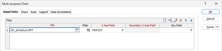
Multi-purpose Chart
![]()
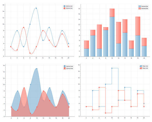
The chart X-axis handles numerical and character fields, simplifying the creation of charts that summarise nominal data like names and codes. Any number of Y-axis fields, which must be numerical, may be added. Each Y-axis field may be displayed using a different style.
Files
File
On the Input Data tab of the Multi-purpose Chart form, double-click (or click on the Select icon) to select the name of the file containing your data. You can optionally apply a filter to select a subset of the data in the file.
X axis field and Secondary X axis field
Double-click (or click on the List icon) to select the field that will be charted along the X axis. If you have chosen to display a Secondary axis for one or more of the Y fields (see below), double-click (or click on the List icon) to select the field that will be charted along the Secondary X axis.
Key Field
Double-click in the Key Field cell (or click on the Select icon) to select the key field for the chart from a list of the available fields in the data file.
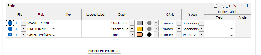
Series
File
Use the drop down in the File cell to select the number of the data file for the series.
Note: Files are numbered automatically as selected in the Files grid. Reordering the rows in the Files grid will change the assigned number.
Field
Use the Select icon to set the relevant field to be graphed for this line in the series.
Legend Label
This cell is used to enter the label for the series row.
Graph
Select the type of graph for the Series row using the drop down in the Graph cell.
Colour/Symbol
These cells are used to select the colour and the symbol to be used to denote the points on the graph.
A range of standard (Circle, Square, Diamond, Triangle, Pentagon, Hexagon, Star) marker symbols are available for selection. If you do not want to show points on the graph, choose None.
X/Y Axis
The drop downs in the X Axis and Y Axis fields are used to select whether to display values along a Primary or Secondary axis in the X or Y direction.
Marker Label
Use the Field and Angle cells to enter the field to be used in the marker label for this row and the angle at which it should be displayed.
Numeric Exceptions
(Optionally) Use the Numeric Exceptions group to control the way that non-numeric values are handled. Non-numeric values include characters, blanks, and values preceded by a less than sign (<).
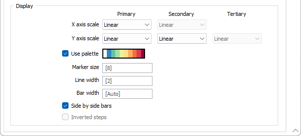
Display
X axis scale and Secondary X axis scale
Select either a Linear or Natural Log scale for the X axis and (if applicable) the Secondary X axis.
Y axis scale and Secondary Y axis scale
Select either a Linear or Natural Log scale for the Y axis and (if applicable) the Secondary and Tertiary Y axis.
Use palette
Select the Use palette check box to use the colours defined in a palette.
Marker size
Use the Marker size field to enter the font size for the marker to be displayed.
Line width
Where a line graph is selected, set the Line width for the display in the field provided.
Bar width
Where a bar graph is selected, set the width of each bar in the Bar width field.
Side by side bars
Select this check box if you want bars in the graph to be displayed side by side.
Inverted steps
Select this check box if you would like the X and Y axis of the graph to be inversed and displayed with side by side bars.
OK
When you have set input options and customised the appearance of the graph, click the OK button to generate the chart.