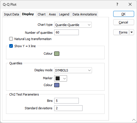
Display Options
On the Display tab of the Q-Q Plot form, choose whether to display a line indicating where the two distributions are exactly equal, set a marker symbol and a colour for the displayed data points, and choose the type of plot you want to create.
Chart Type
There are two types of chart to choose from:
| Plot Type | Description |
|---|---|
| Q-Q |
A Quantile-Quantile plot compares the distributions of two datasets (or a dataset and a theoretical distribution) by plotting their quantiles against each other. If the two distributions match, the points in the plot will fall close to the 45° line representing Y=X. If they do not match, deviations from the line will reveal the differences. |
| P-P |
The advantage of Probability-Probability plots is that they are discriminating in regions of high probability density, since in these regions the empirical and theoretical cumulative distributions change more rapidly than in regions of low probability density. If you compare a data distribution with a particular normal distribution, for example, differences in the middle of the two distributions are more apparent on a P-P plot than they are on a Q-Q plot. |
Number of quantiles
Optionally, enter the number of quantiles (or bins). The number you enter must be between 2 and 2000.
If the number of quantiles is undefined (the input is left blank) the number of quantiles will default to the number of available data.
Natural Log transform
Select this option to perform a log transformation of data values.
Show Y = X line
Enable Show Y = X Line to display a line indicating where the two distributions are exactly equal. The nearer your data is to this line, the better the match between the two distributions.
If this option is selected, double-click to select the colour that will be used to depict the line.
Quantiles
Display mode
Choose the LINE + SYMBOLS option to connect the points on the plot with straight lines. This is the default option, however in some cases, selecting SYMBOLS as the display mode may make the quantiles easier to see
Marker
Select the Marker symbol that will be used to display the data points. Data points are plotted at the X/Y intersection of each quantile. A range of standard (Circle, Square, Diamond, Pentagon, Hexagon, Star, Triangle, Plus, Cross) marker symbols are available for selection in a drop-down list.
Colour
Double click (F3) to select the colour for the Marker symbols.
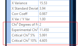
Chi2 Test Parameters
Optionally specify Chi-square goodness of fit parameters to test if the given variable follows the proposed distribution.
Define the number of bins, and the number of standard deviations .
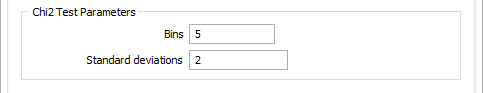
To avoid the erratic tails of a distribution, the test is usually applied to a limited number of standard deviations either side of the mean. For example, if you choose two standard deviations, the test is applied to the range mean - 1 standard deviation to mean + 1 standard deviation.
The number of bins controls the number of intervals used in the Chi-square test. To ensure that the test is representative, confirm that all the bins include at least five samples. The easiest way to do this is to display a histogram with the:
- Histogram Y-axis display set to Count
- Minimum graph limit set to mean - 1 standard deviation
- Maximum graph limit set to mean + 1 standard deviation
- Bin size calculated from the number of bins
You can then review the number of samples in each bin.
Chi2 5% and 10% significance level values are reported in the Properties pane. See: Properties