Decomposition
For example, if soil samples have been collected across different rock types, the data distribution would typically be influenced by the rock types. A probability plot of such a data set may show several straight line regions separated by points of inflection (curved sections). The same sorts of features can be seen in data from a structurally controlled deposit. In this type of deposit, mineralisation has typically taken place along the line of fault. The mineralised material may then have been re-mobilised and further concentrated along cross cutting faults.
The end of one population and the beginning of another will be seen as a “breakpoint” in the data. Typically, the break points will be appear as notches or kinks on the probability plot.
The above discussion describes the way data will appear in a Probability Plot. The Decompose option is also available when the chart is a Histogram or a Cumulative Frequency Curve. By changing the Display mode (on the Chart toolbar) from Probability Plot to Histogram or to Cumulative Frequency, you can see how the same features are shown for each chart type.
To decompose the sample data into populations, select Decompose (on the Chart toolbar) to select the number of components you want to decompose the chart into:
![]()
You can choose to auto select the breakpoints or manually select them:
|
|
|
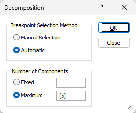
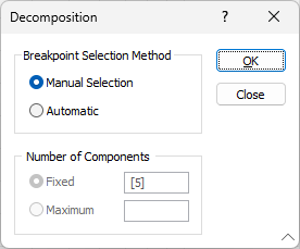
If you have chosen to auto select the breakpoints, you can specify a fixed number of components or any number of components up to a specified maximum (in both cases the default is 5).
If you have chosen to manually select the breakpoints, in the Graph display, click on each breakpoint, that is, the points between populations. You must decide where these are.
Click OK to continue.
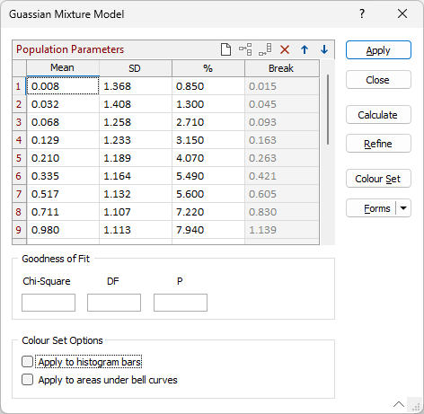
Population Parameters
For each of the populations, the mean, standard deviation, and percentage are shown. These can be edited. Often when a pick of a population is made using the notch points in the lower half of the probability plot, the mean will be over-estimated. (In the upper half it will be under-estimated.)
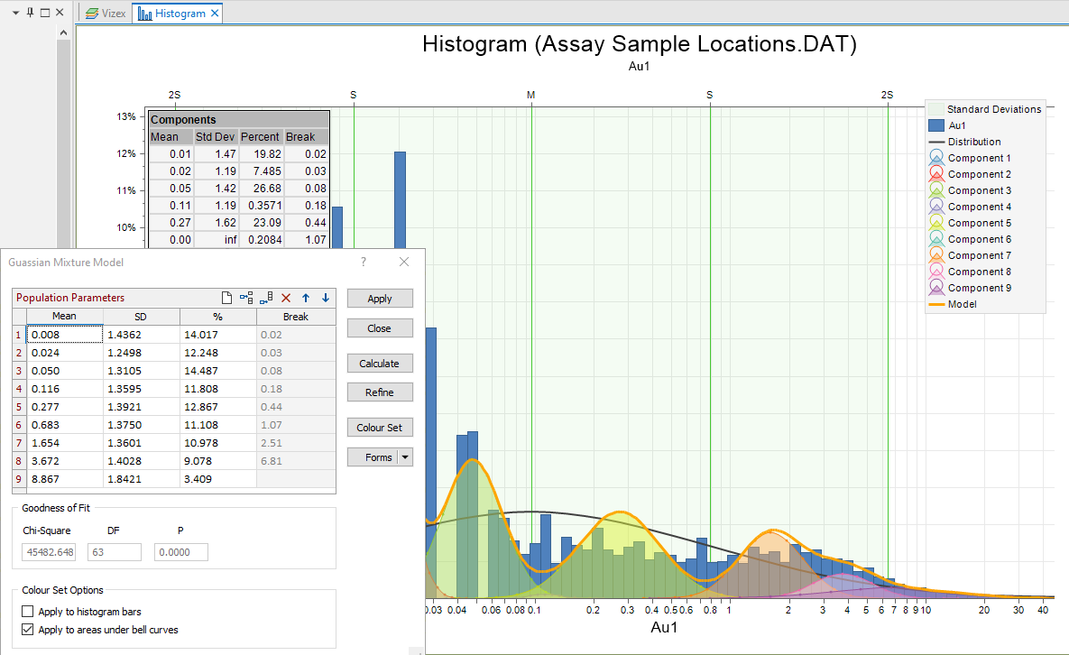
You can change the number of component populations (up to a maximum of 20) by adding or removing rows. If you add a new row to the grid, you will need to enter new Mean, SD (Standard Deviation) and Percentage values for the additional component.
Adjusting the number of rows will alter the shape of the decomposition line.
Use the buttons on the local toolbar to Manage the rows in the list.
Mean
The Mean of each population.
If the data is Ln (Natural Log) transformed, the values will be the means of the Natural Logs of the data values.
SD
The Standard Deviation (SD) of each population.
The SD will be the standard deviation of the Natural Log values if the data has been Ln (Natural Log) transformed.
Percentage %
The % fields show the percentage of measurements in the data set used to estimate the Mean and Standard Deviation of each population.
If you adjust the Mean values and select Run, the decomposition line on the chart will be moved to show the resulting alteration of the mean.
Break
The field values associated with the break points you have defined are displayed.
Goodness of fit
The Chi-square test statistic is updated whenever you load, create, or adjust a decomposition. You can use this number to assess the goodness of fit between the model and the data. The goal of the test is to minimise the Chi2 value, which is ideal when you are comparing different versions of the same model. A more rigorous test is to compare the p-value with a significance level of your choice (e.g. 0.05 or 5%); if the p-value is greater than the significance level, then you can accept that the model matches the data.
Colour Set Options
When a histogram has been decomposed and a colour set is defined (see below), you can apply colours to the chart:
- Apply to histogram bars
Select this option to colour the bars according to their breakpoint values.
- Apply to areas under bell curves
Select this option to colour the areas underneath the population bell curves.
Apply
Click Apply to decompose the sample data using the auto-calculated parameters or the parameters you have manually set. A line representing the decomposed data is drawn on the chart.
If you selected Show populations on the Analysis tab of the Histogram form, the charts of the individual populations will also be shown.
On a Probability Plot, the lines for these different populations will be scattered over the plot. Each of the different population lines show the likelihood of finding a sample of any other value shown on the Probability Plot - given that the data comes from a distribution (normally or Log-normally distributed) with that mean and standard deviation. Viewing the same data on a Histogram will show a better (apparent) correlation with the points on the chart.
Close
Click Close to close the form.
Calculate
Click the Calculate button to auto fit the decomposition after making significant changes to the parameters, for example, changing the number of components.
Refine
Click the Refine button to make small adjustment to existing parameters. Refine attempts to fit the decomposed curve to the actual curve using a least squares algorithm. This option is not guaranteed to give the absolute best fit to the data and you may need to make several attempts at getting the best fit by adjusting the mean of each population as appropriate.
Colour Set
Click the Colour Set button to edit a colour set based on the decomposition of the data. See: Colour Sets for Decomposition
Forms
Click the Forms button to select and open a saved form set, or if a form set has been loaded, save the current form set.