Schedule tab
The Schedule tab is the main section for scheduling, reviewing and reporting.
Before starting any scheduling and in order to view animation and populate any reports you should run period/scenarios/full schedule.

First button to run one single period, second - run scenario, third - run full schedule
Calendar and Animation
Populate your project parameters in the Calendar and Run the scenario.
In the Animation tab, move the slider in the bottom Animation panel to see work progress across the periods.
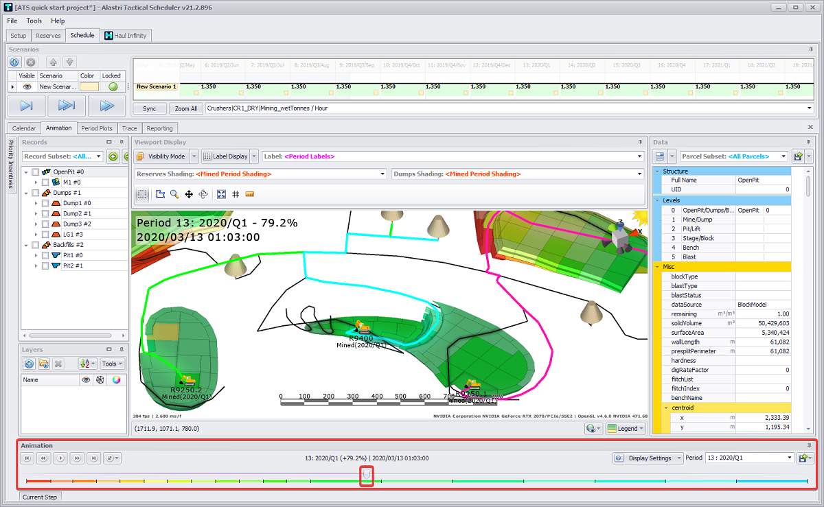
Open the hidden Current Stage tab to see detailed data about each agent movements at the current stage.

Chrono Report
Creating Chrono reports is a useful feature of Alastri Tactical Scheduler. These reports are used to create static report tables to match business standard templates.
-
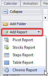
Add a new report in the Reporting tab by clicking Add Report button on the left and selecting “Chrono Report” option from its drop-down.
-
Click in the name field and rename to "Summary".
-
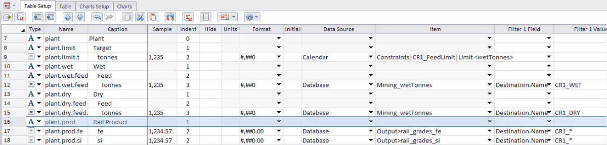
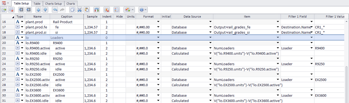
Open the Table Setup tab and fill it in to match your data set, as shown below.
Table Setup
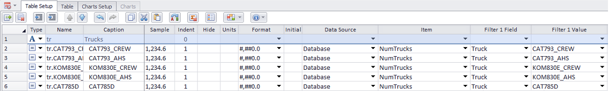
|
Type |
Name |
Caption |
Indent |
Format |
Data Source |
Item |
Filter 1 Field |
Filter 1 Value |
|---|---|---|---|---|---|---|---|---|
|
Title - act like folders. Their only function is to contain child rows. Row - look up a value from some data source. Iter(ative) - can be used to loop over a list of items, and return the value for each item. |
Alphanumeric identifier used to create a unique lookup for the row, which can later be referenced in graph series and calculated fields. It is also used as a lookup code for formulas and charts. |
Display name of the row in the output table. |
Creates nested table fields. |
Excel-style number formatting |
Choose values from the "Database", "Calendar", "OpeningInventory", "ClosingInventory", "Period", "Custom List" or create a calculated field. |
Choose a field from the data source or enter a calculation. |
Filter the data by these fields. |
Filter the data where the filter field equals these values. |
|
Title |
tr |
Trucks |
0 |
|
|
|
|
|
|
Row |
tr.CAT793_CREW |
CAT793_CREW |
1 |
#,##0.0 |
Database |
NumTrucks |
Truck |
CAT793_CREW |
|
Row |
tr.CAT793_AHS |
CAT793_AHS |
1 |
#,##0.0 |
Database |
NumTrucks |
Truck |
CAT793_AHS |
|
Row |
tr.KOM830E_CREW |
KOM830E_CREW |
1 |
#,##0.0 |
Database |
NumTrucks |
Truck |
KOM830E_CREW |
|
Row |
tr.KOM830E_AHS |
KOM830E_AHS |
1 |
#,##0.0 |
Database |
NumTrucks |
Truck |
KOM830E_AHS |
|
Row |
tr.CAT785D |
CAT785D |
1 |
#,##0.0 |
Database |
NumTrucks |
Truck |
CAT785D |
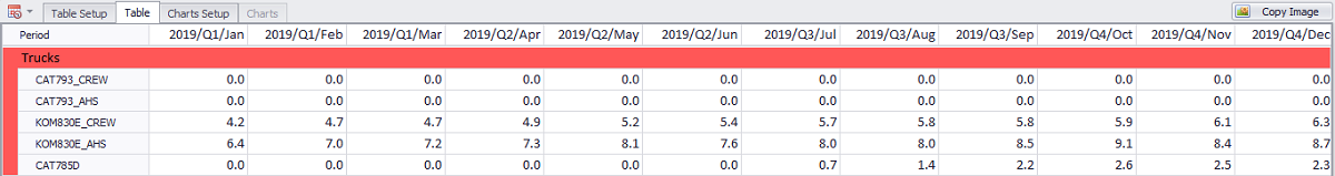
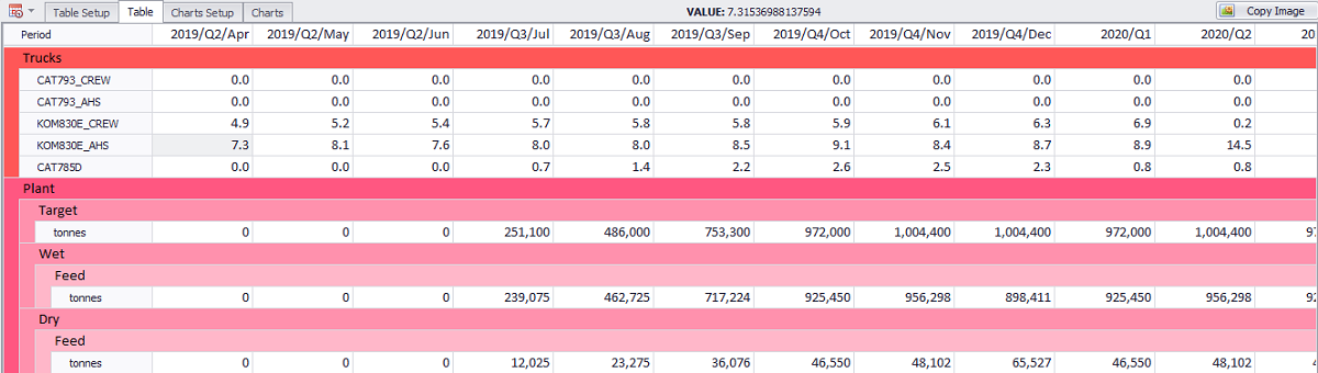
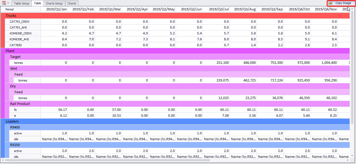
2. Go to the Table tab to review Trucks performance across different periods.
Trucks Table
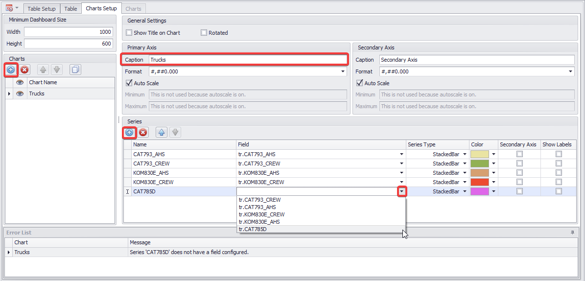
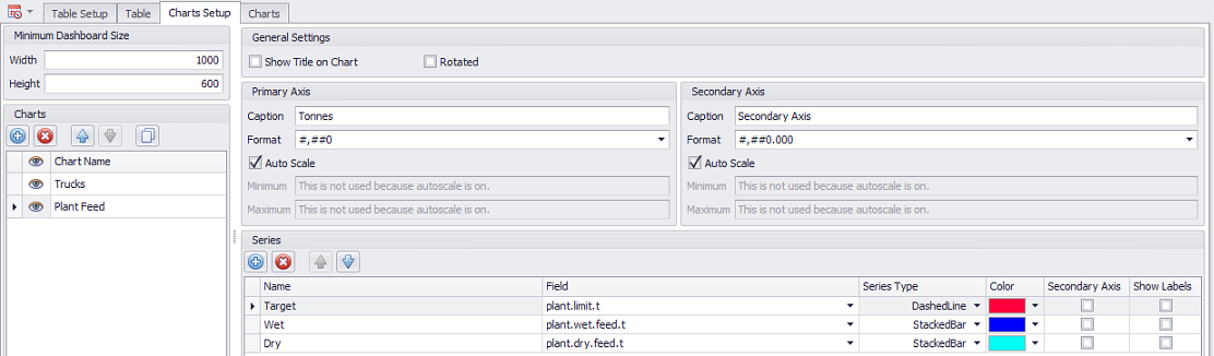
3. Open the Chart Setup tab to set a chart based on previously added fields.
-
In the Charts panel press the blue plus button to add a new chart. Name it “Trucks”.
-
In the Primary Axis section add a caption “Trucks”.
-
In the Series panel add five truck types and name them accordingly: “CAT793_AHS”, “CAT793_CREW”, “KOM830E_AHS”, “KOM830E_CREW” and “CAT785D”.
-
From the Fields drop-down select a relevant field for each truck.
-
Set a series type to be shown in the main Charts tab. In this exercise we use “StackedBar” type, but you can use the one you like better, and change it at any time.
-
Select a desired color for each series using the Color drop-down.
Truck Chart Setup
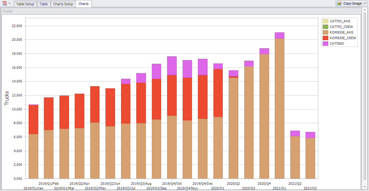
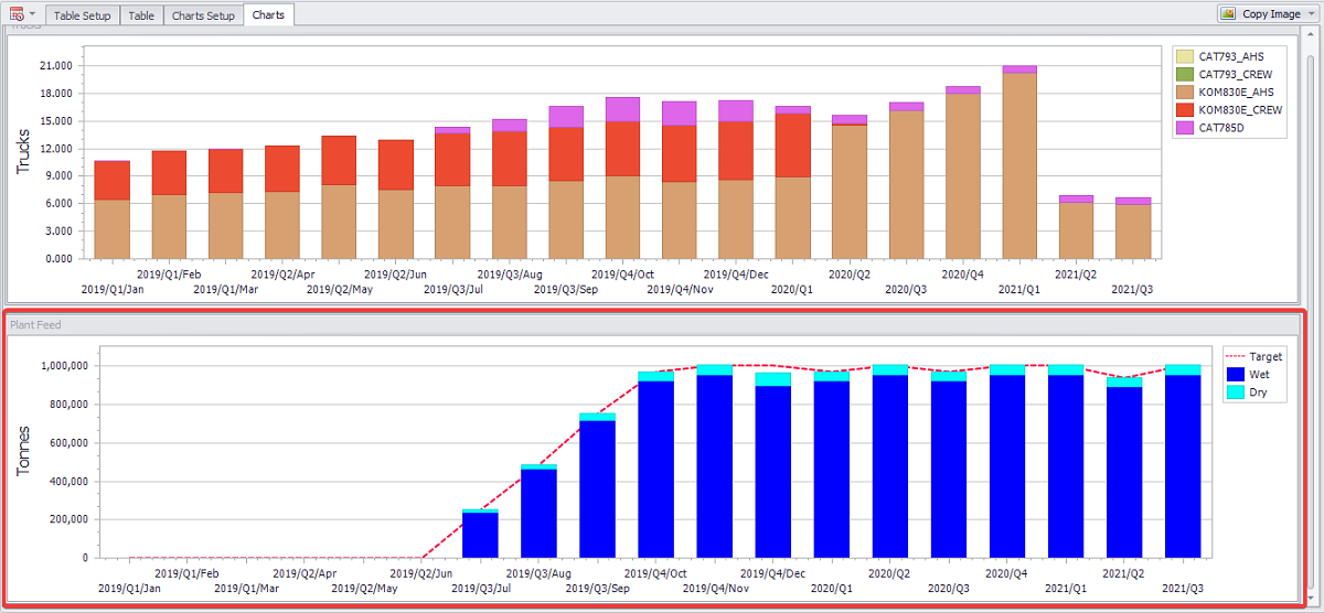
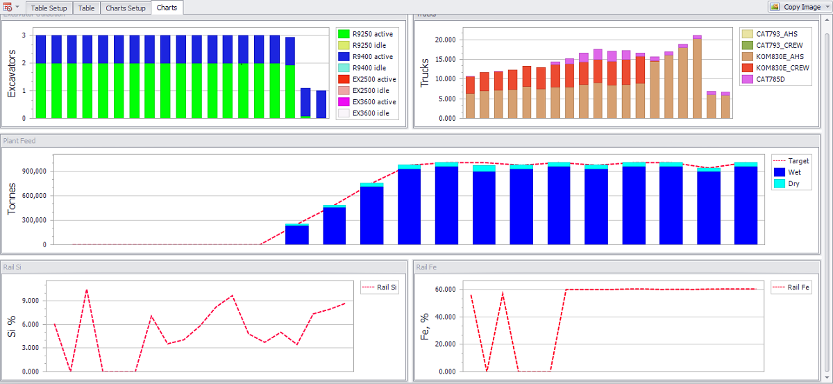
4. When completed, and no errors left in the Error List, you can open the Charts tab and review graphical representation of the data populated, based on trucks performance by given periods.
Review results in the Charts Tab
Exercise 1.
Create a Chart to display Plant Feed tonnes, based on wet and dry tonnes feed and target limit.
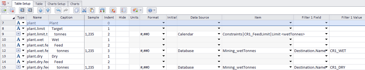
1. Fill in the Plant Feed data in the Table Setup tab as shown below.
2. Preview results in the Table tab.
Table tab results
3. Create “Plant Feed” chart with a capture “Tonnes”, “#,##0” format and add “Target”, “Wet” and “Dry” series. Set relevant fields, types and colors for each series.
Feed Plant Chart Setup
For the Target series type, it is recommended to use a different series type, such as “DashedLines”, to visually show the actual feed against the target one.
4. Go to the Charts tab and review the result. If all data was populated correctly, your Plant Feed chart should look like in the example below.
Exercise 2.
Create a Chart to display Fe and Si percentage, based on Plant Production Rail.
-
Fill in the Plant Production data in the Table Setup tab as shown below.
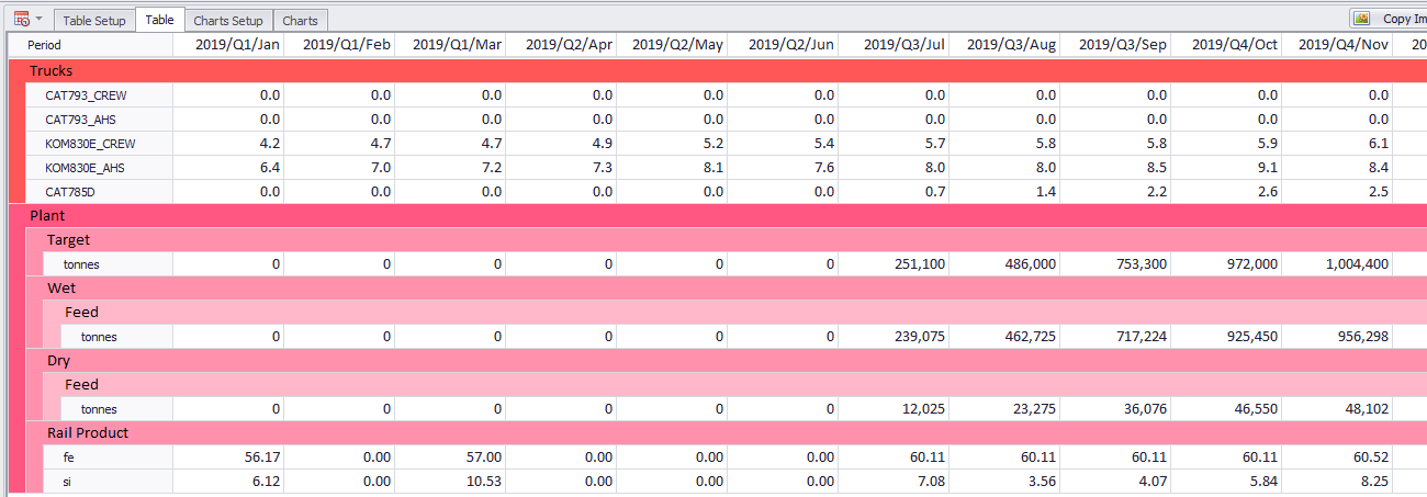
2. Preview results in the Table tab.
Table tab results
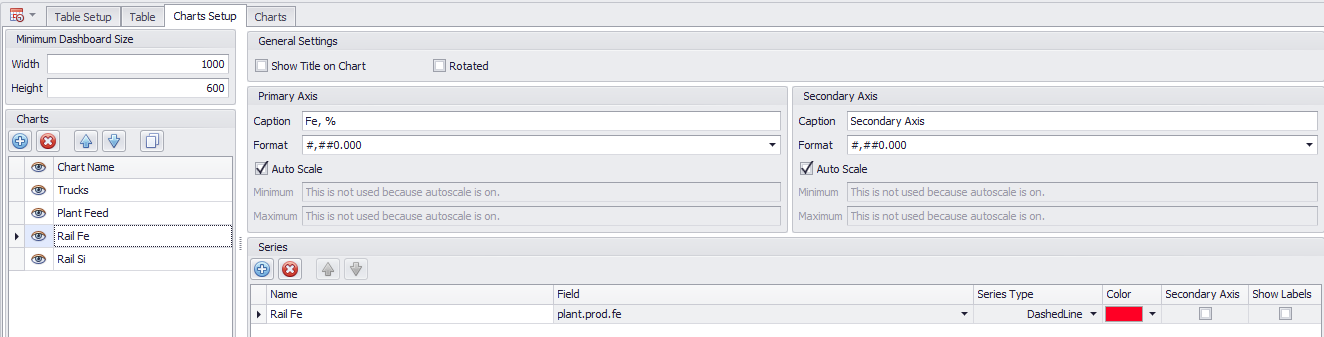
3. Create “Rail Fe” and “Rail Si” charts with captures “Fe, %” and “Si, %” accordingly. Choose “#,##0.000” format and add “Rail Fe” and “Rail Si” series. Select relevant fields, types and colors for each series.
Rail Fe Chart Setup
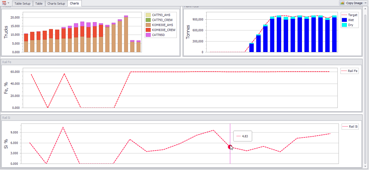
4. Go to the Charts tab and review the results. If all data was populated correctly, your Rail Fe and Rail Si charts should look like in the example below.
Exercise 3.
Repeat the same steps to create a chart, showing Excavators Utilization, based on Loaders types and their state (active or idle).
Fill in all the relevant data as required
You can move blocks of charts in the Charts tab as desired, by dragging and dropping them. For example, you can place Excavators and Trucks Utilization, or Si and Fe percentage charts next to each other to visually compare them.
If you complete all the exercises correctly, your final Charts tab will look as shown below:
Exporting Report
Alastri Tactical Scheduler provides user with different export options.
-
You can export capture of Table and Charts tabs data, by pressing the Copy Image button.
Copy Image button location
Note that in the Charts tab you can copy the entire image or selected charts.
The Copy Image button will save the capture to the clipboard, ready for pasting in users reports, presentations or any other documents.
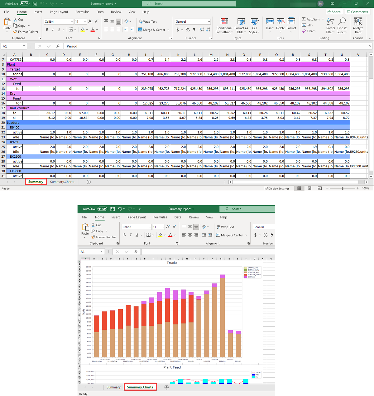
2. Use the Export Manager button to export selected reports in “.xlsx” format.
3. Select a report required and press Export Selected button to export one report in “.xlsx” format.
-
Specify the saving path and a file name.
-
Open saved report in Microsoft Excel - you should see Table and Charts data tabs views.