Table Plots
Table plots allow for coloured, 3D visualisation of Table Data such as strip ratio plots.
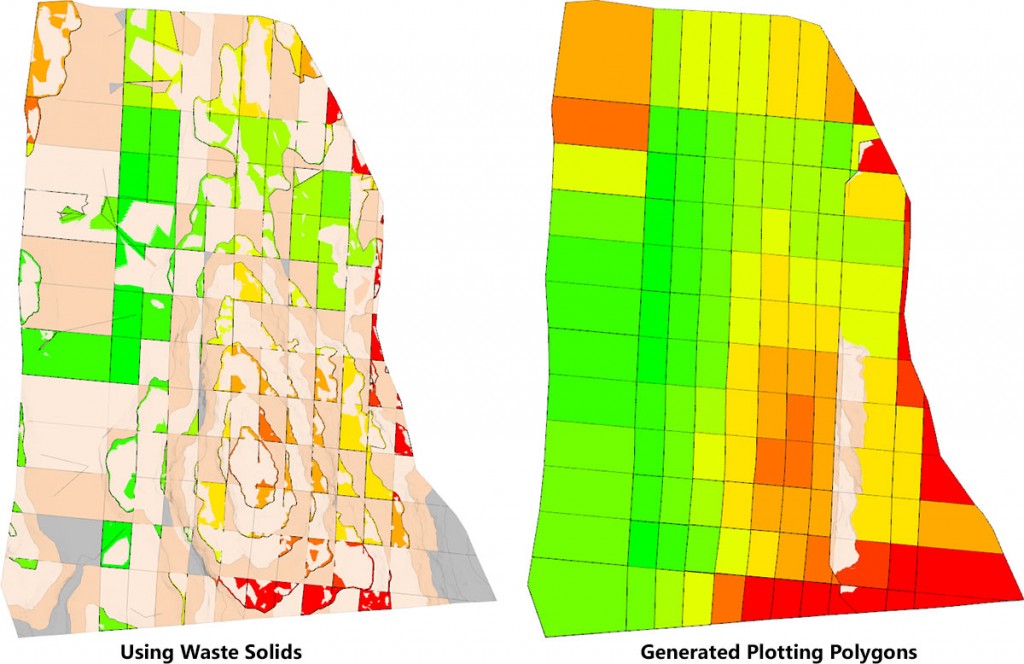
Plotting Polygons vs. Regular Solids
Plotting Polygons are created and designed specifically for use in Table Plots. Why not just use your regular solids? The reason is that Table Plots use grouping (such as grouping Strip and Block together to form a vertical stack) and only the first solid from a group is used. See the example below and the Practical Section for how to use the Generate Plotting Polygons tool.
To create a new Table Plot, in the Project Explorer, right-click on a Data Table and select Setup | Table Plots.
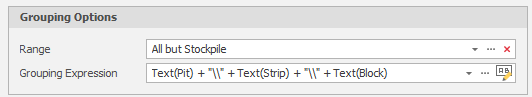
Grouping Options
Range
Set a Range for the Table Plot. See: Ranges
Grouping Expression
Click the Generate Grouping Expression button to auto generate a grouping expression based on the levels defined in your table data.

Similar to Grouping Expressions used in Sequence Dependencies and Proximity Constraints. Must evaluate to a text result. For most Table Plots, this should represent the XY coordinate Levels such as Strip, Easting & Stage.
Example: Text(Strip) + "\\" + Text(Block)
Tip: Use the Maximise button at the top right of the Table Plots window to more easily edit your expressions and colour legend settings, etc
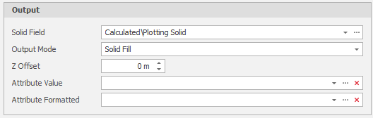
Output
Solid Field
Select the Solid field that will be used to generate the plotting polygons.
Output Mode
Choose a (Solid Fill or Outlines) Output Mode.
Z Offset
The Output polygon Z level will be offset by the specified amount.
Attribute Value
The evaluated value from the Value Expression will be stored on the selected attribute on each shape in the generated group.
Attribute Formatted
Specify the format string applied to the value when setting the attribute value.
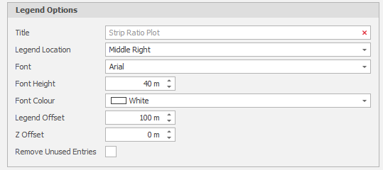
Legend Options
Title
(Optional) The Title that will appear at the top of the legend.
Legend Location
Set the Vertical (Top/Middle/Bottom) and Horizontal (Left, Centre, Right) location of the legend in the Design window.
Font, Font Height, Font Colour
Set the font characteristics of the Legend Text.
Legend Offset
The legend will be offset by the specified amount. The offset direction depends on the legend location:
-
None: Ignored.
-
Top left: Left.
-
Top centre: Up.
-
Top right: Right.
-
Middle left: Left.
-
Middle right: Right.
-
Bottom left: Left
-
Bottom centre: Down.
-
Bottom right: Right.
Z Offset
The Z level of the legend will be offset from the generated polygons by the specified amount.
Remove Unused Entries
Select this check box to only show legend keys that have been used in the generated table plot.
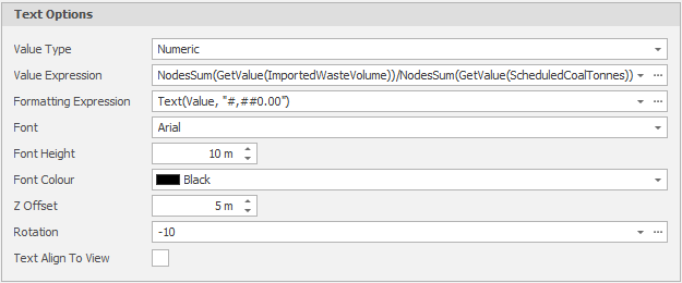
Text Options
Value Type
Select Numeric or Date Time as the Value Type.
Value Expression
When the Value Type is Numeric: Must evaluate to a Numeric result. NodesMax, NodesMin, NodesSum and NodesWeightAvg are new Functions that refer to the groups set in the Grouping Expression. Example: NodesWeightAvg(GetValue(CoalAsh),GetValue(CoalTonnes))
When the Value Type is Date Time: Must evaluate to a Date Time result.
Formatting Expression
Must evaluate to a Text result. Example: Text(Value, "#,##0.00%") or Text(Value, "MMM/yyyy")
Font, Font Height, Font Colour
Set the font characteristics of the Text.
Z Offset
Rotation
Optionally, enter a rotation value to rotate the text.
Text Align To View
Select this check box to align the text to the plane of the view.
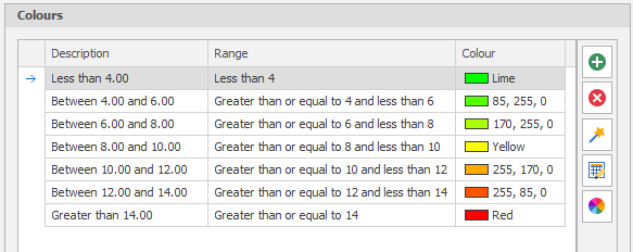
Colours
To change the order or the number of the intervals in the legend and set interval colours, use the tools provided on the sidebar:
|
|
Add an interval. |
|
|
Delete the currently selected interval(s). |
|
|
Use the Bulk Editor to make bulk modifications to the intervals definition. |
Click on a Colour box to apply a colour from a theme or assign a custom colour. Alternatively, use one of the following tools:
|
|
The Table Plot Colour Wizard allows you to automatically create colour ranges for your Table Plot. If no colours are chosen the resulting Table Plot will be white. |
|
|
Click the Palette icon to apply a Colour Palette to the table plot. |
| You can also use the SHIFT key to select multiple intervals, then right-click and select Apply Colour Palette for just the intervals you have selected. |
Generate Layer
Generate a Table Plot by clicking the Generate Layer button, which will generate a layer with the same name as your Table Plot.
Note that the Solid that is used in a Group is the first Index. If you need to create specific solids for Plots you can do this using the Generate Plotting Polygons tool.