Settings
Gantt Chart
Use the main tab of the Gantt Chart Settings dialog set the Name, Layout and Appearance of the Gantt Chart:
Name
You can edit the Name of the Chart here.
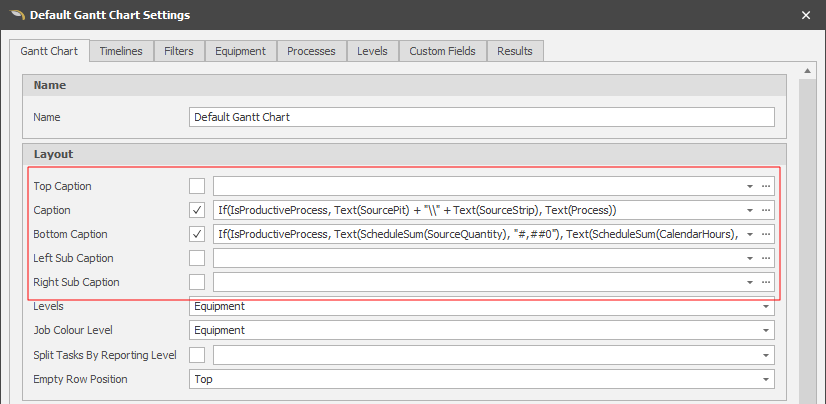
Layout
Set the captions which will be used with colours to group tasks in the Gantt Chart.
Captions (Top, Bottom, Main, Left Sub, Right Sub)
Captions are similar to Filter Type Custom Fields, in that they return a Text String that groups lines of an Output Schedule together.
There are multiple Caption positions (Top, Main, Bottom, Left and Right Sub) and these will affect Task Grouping on the Gantt Chart.
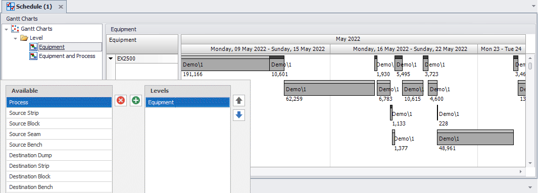
Levels
The default Level is Equipment, however you can change this and/or add levels to create a cascading structure. The Level or Levels also set the Background Colour.
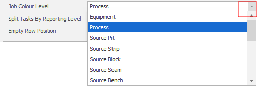
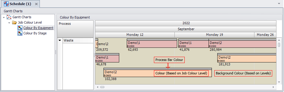
Job Colour Level
Each group has a main colour which is set by the Job Colour Level. In this case, Process Colours are applied to each group:
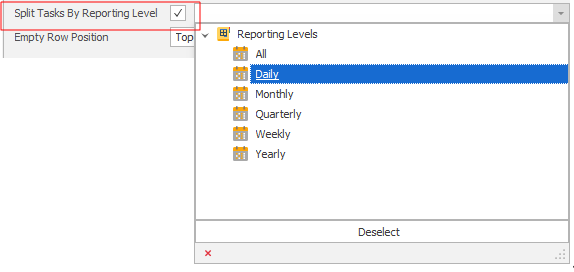
Split Tasks by Reporting Level
This option allows you to split Grouped Tasks by a selecting a Reporting Period from the drop down menu and selecting the box next to the field:
Empty Row Position
Select where you want empty (blank) rows to be inserted:
| Top | Insert an empty row above the selected row/cell. |
| Bottom | Insert an empty row below the selected row/cell. |
Appearance
The Gantt Chart displays Appointments (or Tasks) as horizontal bars along timescales. Use the settings in the Appearance group to set the appearance of Appointment bars, captions, tooltips and associated fonts.
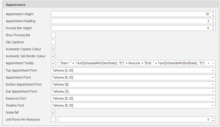
Appointment Height and Padding
Accept the defaults or use the increment controls to adjust the height of the appointment bars and the padding (spacing) that will be shown between the rows of the chart.
Process Bar Height
Set the height of the process bar (in pixels).
Show Process Bar
If the only difference between groups of Tasks is the Process (and it is not being used in the Captions or Levels) then turning off the Process Bar combines those groups.
Clip Captions
When this option is selected, the chart is limited to one row per level. If necessary, the row is clipped. When this option is NOT selected, the number of rows a given resource can take up is unlimited.
Automatic Caption Colour
Ticking the Automatic Caption Colour option has the effect of automatically changing the colour of your Header Text. Based on the colour of your Caption, the text will change to White or Black for best readability.
Automatic Job Border Colour
Ticking the Automatic Job Border Colour option applies the same principle (as described above for the Caption Colour) to the border of your jobs.
Appointment Tooltip
Specify a tooltip that will be displayed when the mouse is hovered over a job.
Top, Bottom, Sub Appointment & Resource Fonts
Specify the fonts that will be used to display Appointments (including Top and Bottom and Sub appointments) and Resources text.
Waterfall
Select this check box to create a Waterfall Gantt Chart. When this option is selected, appointments are cascaded so that there is only one appointment per row, with the appointments ordered by date.
Limit Rows Per Resource
Tick this check box to limit the number of rows displayed per resource. Use the spin control to set the number of rows.
Note that a Filtered property will be removed from the Gantt Chart visually but will not affect Grouping (leaves gaps), whereas a Hidden property will be removed from the Gantt Chart completely (combines surrounding Groups).