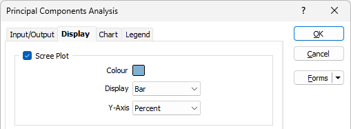
Display
On the Display tab of the Principal Components Analysis form, choose how the analysis will be represented in a plot:
Scree Plot
Select this option to use the size of the eigenvalues to select the number of components to analyse. The ideal pattern is a steep curve that bends to form a straight line.
The Scree Plot shows the number of the principal component versus its corresponding eigenvalue and orders the eigenvalues from largest to smallest. The eigenvalues of the correlation matrix equal the variances of the principal components.
Colour
Choose a colour for the Bars or Lines on the Scree plot.
Display
Choose a (Bar, Line, Bars and Lines) Display mode for the Scree plot.
Y-Axis
Choose the (Percent or Eigenvalue) units of the Y-Axis.
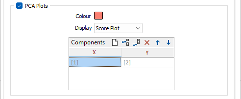
PCA Plots
Any number of plots can be created using the Components grid list. Each row of the grid defines what component to show on the X and Y axis on each plot. The default is just one plot showing the first two components.
Choose a display colour for the elements shown on one of the following plots:
Score Plot
Select this option to graph the scores of the second principal component versus the scores of the first principal component.
The Score Plot can be used to detect clusters, trends, and outliers, in the data. Data groupings on the plot may indicate separate distributions in the data. If the data follow a normal distribution and there are no outliers, then the points are randomly distributed around zero.
Loading Plot
Select this option to graph the coefficients of each variable for the first component, versus the coefficients for the second component.
The Loading Plot can be used to indicate which variables have the largest effect on each component. Loadings close to the lower limit or the upper limit, in the range -1 to 1, indicate that the variable strongly influences the component. Loadings close to zero indicate that the variable has a weak influence on the component.
BiPlot
Select this Option to combine a Score Plot and a Loading Plot on the same plot.
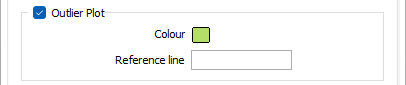
Outlier Plot
Select this option to identify outliers in the data. The Outlier Plot displays the Mahalanobis distance for each observation and a reference line to identify outliers (the points above it). The Mahalanobis distance is the distance between each data point and the centroid of the multivariate space (the overall mean).
Colour
Choose a display colour for the elements shown on the plot.
Reference line
(Optional) Specify a cutoff value for the reference line by entering the absolute position of the line on the Y axis. No line will be shown if this field is left blank.
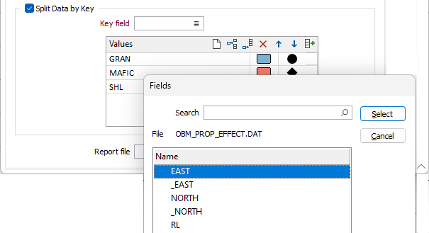
Split Data by Key
Select this check box to split data according to the values of a key field.
Key field
Double-click, or click on the List icon, to select a field in the input file.
Key value
On each row of the grid, double-click in the Key Value column to select a field value:
![]() Auto-fill of the keys grid will auto-populate the grid with all unique values (up to a maximum of 30) of the supplied key field, each with a different colour.
Auto-fill of the keys grid will auto-populate the grid with all unique values (up to a maximum of 30) of the supplied key field, each with a different colour.