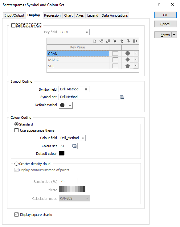
Display
On the Display tab of the Scattergrams form, choose whether to split the data by key field values, or set symbol-coding and colour-coding options for the data points.
Split Data by Key
Select this check box to split data according to the values of a key field.
Key field
Double-click, or click on the List icon, to select a field in the input file.
Key value
On each row of the grid, double-click in the Key Value column to select a field value:
![]() Auto-fill of the keys grid will auto-populate the grid with all unique values (up to a maximum of 30) of the supplied key field, each with a different colour.
Auto-fill of the keys grid will auto-populate the grid with all unique values (up to a maximum of 30) of the supplied key field, each with a different colour.
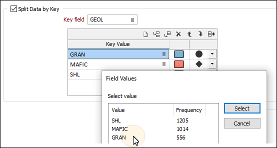
Accept the defaults or select a colour and a symbol for each key group.
Use the buttons on the grid list toolbar to Manage the rows in the list.
Note:
- If Multi-chart Layout is selected (on the Input/Output tab), a graph will be created for each key group.
- If Display Regression Line is selected (on the Regression tab), a regression line will be displayed for each key group.
- If you have chosen to split the data by key field values, the Symbol Coding and Colour Coding options described below are not enabled.
Symbol Coding
Symbol field
To display data points as symbols, specify the name of the field (in the input file) containing the data that will control which symbol is displayed.
Symbol set
Double-click (F3) to select the set that will be used to control which symbol is displayed. The symbol set determines a symbol for each value in the chosen (mapped) Symbol field. Right click (F4) to create or edit a symbol set.
Note that chart symbol sets are separate to the symbol sets used elsewhere in the application. Ranges may be assigned to them in the usual way.
Default symbol
You can either accept the default symbol displayed or double-click on this symbol to choose a different one. A range of standard (Circle, Square, Diamond, Pentagon, Hexagon, Star, Triangle, Plus, Cross) marker symbols are available for selection in a drop-down list.
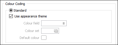
Colour Coding
Select the Standard colour coding option to colour-code the points on the graph using a nominated colour field and colour set.
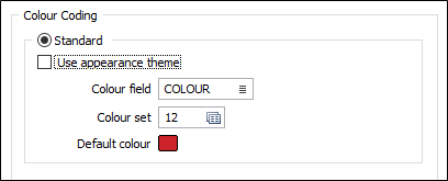
Colour field
Specify the name of a field which contains the values that will be used to colour-code the display.
You can choose to select colour values directly from the Colour field without selecting a Colour set. In this case, the values in the Colour field must be valid RGB, Hex, or Integer colour definitions.
| Format | Example |
|---|---|
| R,G,B | 89,169,215 |
| HTML Hex | #59A9D7 |
| Hex | 0x59a9d7 |
| int | 5876183 |
Colour set
To map values in the Colour field to the colour values in a Colour set, double click (F3) to select the set that will be used to control the display colour. Right-click (F4) to create or edit a Colour set.
Default colour
Double-click (F3) to select the colour that will be used when a Colour field or a Colour set is not defined - or when a value in the Colour field is either not valid or is not mapped in the Colour set.
Use appearance theme
Select this option to override any colour settings and apply the theme colours you have selected on the Chart of the form.
Scatter density cloud
When there is a high density of data points it may be difficult to identify the zone where most of the data lies within the mass of points. This can be resolved by dividing the data into ranges and then colour-coding each point according to the density of the points within its neighbourhood.
The size of each neighbourhood is a percentage of the X- and Y-range of the chart, with typical values ranging from 2% to 20%. Sparser or more evenly distributed data may require a larger neighbourhood.
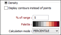
Display contours instead of points
If the number of points is greater than the ScattergramsMaxPointsThreshold, this check box option is enabled. The default ScattergramsMaxPointsThreshold (defined in the Micromine .ini file) is 120000.
Sample Size (%)
Enter a sample percentage value which will be used to calculate the diameter of the counting ellipse used to count the points around each point in the file (point colouring mode) or each point of the virtual grid (point contouring mode).
Palette
The colours you assign to the ranges in a colour set or a hatch set can be saved as a palette, which is simply a list of RGB colour values. These palettes - and other default system palettes - are available for selection when you click the Select button in the Edit Colour Set or Edit Hatch Set form.
Calculation mode
Choose the mode of calculation. If you choose RANGES, the data will be divided into equal ranges. If you choose PERCENTILE, the function will divide the data into ranges each containing the same number of values; the highest and lowest value in each bin will define the upper and lower values for each range.
Display square charts
If X and Y axis values have the same magnitude, select this option to automatically adjust the axes to produce a square chart.