Regression
Whenever you create a report file in a multiple regression (where there is more than one X-axis field), interactively changing the X- or Y-axis field names will append the new combination to the report.
This facility provides a way to quickly accumulate the reports corresponding to each X/Y field combination. However, the report file will grow very quickly, so you should avoid using a report file (specified on the Input/Output tab) until you have finished exploring your data.
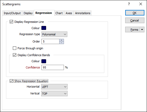
Display Regression Line
Select this check box to display a regression line on the chart. If you have chosen to the split the data by key field values (on the Display tab of the form), a regression line will be shown for each group, using the colours you have defined for each group.
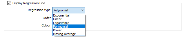
Regression type
There are 6 regression line types to choose from. Which type you choose will depend on the trend in your data.
A display colour may also be applied to the regression line using the Colour selector.
| Type | Description |
|---|---|
|
Linear |
A straight line of best fit for simple linear data. A Linear regression line shows a steady rate in the increase or decrease of data values. |
|
Exponential |
A curved line of best fit for data values which fall or rise at increasingly higher rates. Note that you cannot use this regression type when the data contains negative or zero values. |
|
Logarithmic |
A curved line of best fit for data values which increase or decrease quickly and then level out. Note that both negative and positive values can be used. |
|
Polynomial |
A curved line of best fit for data values which fluctuate. The order of the polynomial may be determined by the number of fluctuations (hills or valleys) in the data. |
|
Power |
A curved line of best fit for data values that increase at a specific rate. Note that you cannot use this regression type when the data contains negative or zero values. |
|
Moving Average |
Select this option when you need to smooth out fluctuations in the data to show a trend or pattern more clearly. This type of regression uses a specific number of data points (as set by the Period input), calculates an average value, and then adds this value as a point on the regression line. |
Order
For the Polynomial regression type, the number of fluctuations (hills or valleys) in the charted data.
An order 2 polynomial typically has only one hill or valley, an order 3 polynomial has 1 or 2, and an order 4 polynomial as many as 3.
Period
For the Moving Average regression type, the number of data points used to calculate the average values.
If Period is set to 3, for example, then the average of the first three data points is used as the first point on the moving average regression line. The average of the second, third and fourth data points is used as the second point on the regression line, and so on.
Force through origin
Select this option to force the regression line through the X/Y origin.
Display Confidence Bands
Select this check box to display confidence bands in the output.
Colour
Double-click to select a colour that will be used for the bands.
Confidence
Enter a Confidence value. This is a percentage value which determines the range of sample means that will include the true mean.
For example, to be 90% confident, we estimate that the sample mean is somewhere in the middle 90% of the distribution of the sample means.
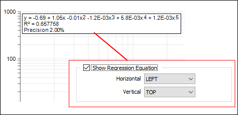
Show Regression Equation
If you have chosen to display a regression line, select this option to display the equation and the R-squared value for the regression line and set the Horizontal (LEFT, CENTRE, RIGHT) and Vertical (TOP, CENTRE, BOTTOM) position of the annotation.
Forms
Click the Forms button to select and open a saved form set, or if a form set has been loaded, save the current form set.