Toolbox
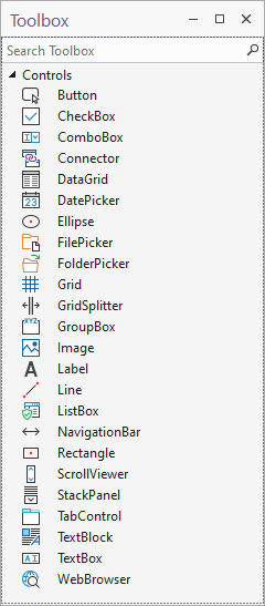
The Toolbox pane contains a list of the container and user interface controls that can be dragged and dropped onto the Design Sheet.
For more information about the types of control you can add to a form, see: Working with Containers and Working with Controls.
| Control | Description |
|---|---|
|
The Button control is used to trigger an action (for example, open a Micromine Geobank object or execute a process) when clicked by the user. |
|
|
The CheckBox control allows the user to toggle an option on or off, usually reflecting a Boolean (Yes/No or True/False) value. When they are presented as a list of options, any combination of check boxes may be selected or de-selected. |
|
|
The ComboBox control provides a drop-down version of the ListBox control, allowing for the selection from multiple, contiguous or non-contiguous items in a list. Since a ComboBox takes up less space than a fully exposed list of items, the use of a ComboBox is often preferred. |
|
|
|
|
|
The DataGrid control allows you to interact with and edit the rows and columns of a Dataset in a customisable grid. See: DataGrid |
|
|
The DatePicker control allows the user to pick a date value using a ComboBox selection for the Month, Day, and Year components of the date. If an object opened in a form has configured substitution parameters, the This is necessary for parameter values to be successfully passed to other (query, import, export, data view, report, application, drillhole utility, coal utility) objects. |
|
|
The Ellipse control allows you to specify an elliptical (or circular) region on a form. Width, Height, Fill colour and Border (outline) properties can be specified. By default, when you add an ellipse to a form, the width and the height of the ellipse are equal to each other, making a Circle. |
|
|
The FilePicker control allows the user to pick a file using a file explorer window. |
|
|
The FolderPicker control allows the user to pick a folder using an explorer window. |
|
|
The Grid is the primary container for the controls you add to a form. When you create a form, a Grid is superimposed on the Design Sheet in the Form Designer. The Grid size determines the size of the form when it is undocked from a Micromine Geobank tab. Additional grids may also be nested within this primary container or within other containers. For this reason, all controls have GridColumn, GridRow, GridColumnSpan and GridRowSpan settings which define their cell position within the grid. By default, a grid comprises one row and one column, however additional rows and columns may be added. The height and width of the rows and columns can be expressed as an absolute measure in pixels, be calculated as a proportion of the full size of the grid, or be calculated automatically depending on the content. |
|
|
The |
|
|
The GroupBox control is a container commonly used to group other user interface controls (i.e. CheckBoxes, Radio buttons, ComboBoxes, etc.) under a heading and within a border. |
|
|
The Image control allows you to display an image in one of several (BMP, GIF, ICO, JPEG, PNG) image file formats. |
|
|
The Label control allows you to put a short line of text on the screen. A TextBlock is preferred for multiple lines of text. |
|
|
The Line control draws a horizontal or vertical line on the form or an object on the form. |
|
|
The ListBox control allows the selection of multiple, contiguous or non-contiguous items in a list. |
|
|
The NavigationBar control provides (First, Previous, Next, Last and New) navigation between the records in a dataset. |
|
|
The Rectangle control allows you to specify a rectangular region on a form. Width, Height, Fill colour and Border (outline) attributes can be specified. Corners may be rounded by specifying a corner radius. |
|
|
The ScrollViewer control enables content to be displayed in a container which is smaller than the extents of the content. You can then scroll to view any part of the content that is not visible when the container (typically a grid) is resized. |
|
|
The StackPanel container control will position each of its child controls in a line, vertically (default) or horizontally, and displays a scrollbar when there is no more room horizontally or vertically. Use the StackPanel when you want a variable set of controls. |
|
|
The tabs of a TabControl are usually placed at the top of a form to provide multiple tabs for page navigation; however, tabs may also be placed at the Bottom, Left and Right of a form. Each TabControl consists of multiple TabPage objects that share the same screen space, with only one tab visible at a time. |
|
|
The TextBlock control allows you to put text on the screen as an alternative to the Label control. Typically, the Label control is used is for short, one-line text (and sometimes images), while the TextBlock is used for multi-line strings and is a text-only control. |
|
|
The TextBox control is a very basic text-input control which allows the user to enter a single line |
|
|
The WebBrowser control allows you to host a web browser within your application. |