GridSplitter
The
Properties
Key properties of the GridSplitter determine its size and orientation:
- Height and Width.
- HorizontalAlignment and VerticalAlignment.
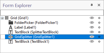
Note: To be selectable by the user, the GridSplitter must be the front-most control within its container.
In the Form Explorer, the controls within each container are shown in back-to-front order. In the following example, GridSplitter is the front-most control within Grid (GridwithSplitter) and is the last control listed under that container.
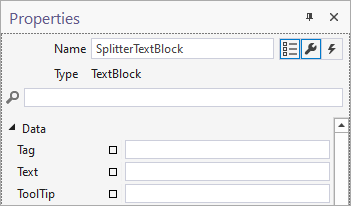
A TextBlock (SplitterTextBlock) has also been added to the form as a visual aid:
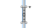
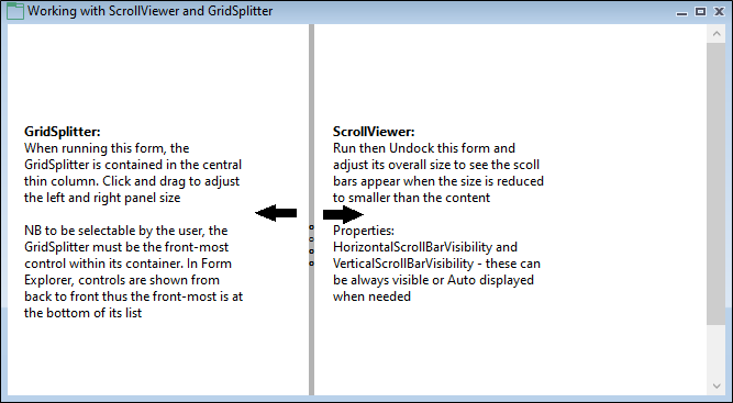
When you run the form, you can click and drag the “handle” to adjust the left-right panel size:
For a Gridsplitter with a vertical orientation:
- Place a GridSplitter within its own column and set the height/width of the column to Fixed.
- Select the GridSplitter and set the following properties:
- Set Height to NaN (undefined) and set the Width (i.e. 5 pixels).
- Set VerticalAlignment to Stretch and set a HorizontalAlignment other than Stretch.
- Set Margin to 0.
- Place a Grid to the Left of the GridSplitter, within its own column, and set the column height/width to Fixed.
- Place a Grid to the Right of the GridSplitter, within its own column, and set the column height/width to Fixed.
The Cursor property is automatically set to SizeWE (West-East).
For a Gridsplitter with a horizontal orientation:
- Place a GridSplitter within its own row and set the height/width of the row to Fixed.
- Select the GridSplitter and set the following properties:
- Set Width to NaN (undefined) and set the Height (i, e. 5 pixels).
- Set HorizontalAlignment to Stretch and set a VerticalAlignment other than Stretch.
- Set Margin to 0.
- Place a Grid Above the GridSplitter, within its own row, and set the row height/width to Fixed.
- Place a Grid Below the GridSplitter, within its own row, and set the row height/width to Fixed.
The Cursor property is automatically set to SizeNS (North-South).