Chart | Histogram
The Chart | Histogram window comprises two parts: the Graph and the Properties window. The Graph comprises three parts:
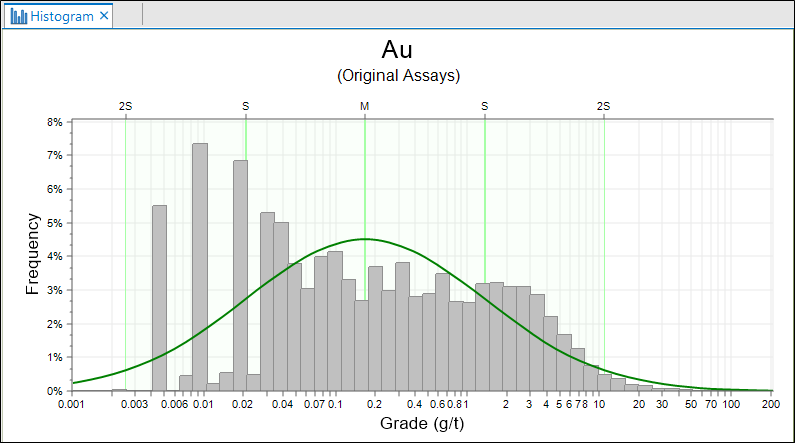
- The raw data, displayed using the input colour
- The standard normal curve of a theoretical sample with the same mean and standard deviation as the raw data, displayed using the distribution colour, and
- Vertical lines at the mean (M) and standard deviations (S, 2S) either side of the mean, displayed using the band colour.
When you generate a chart, many of the tools and options on the Chart ribbon are common to most charts. See: Chart Tools
Visually, the Histogram graph allows you to determine much about your data:
- Is it normally distributed? In other words, how well does it fit the bell-shaped standard normal curve?
- If the fit is poor, can you describe the discrepancies in terms of Skewness and Kurtosis, multiple peaks or anomalous regions?
Tools on the Chart | Histogram tab, in the Histogram group, allow you to visualise and quantify the answers to many of these questions:
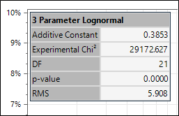
- Click the 3 Parameter Log Normal button to estimate the additive constant for a 3-parameter log-normal distribution. See: 3 Parameter Log Normal
![]()
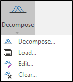
- Select an option from the Decompose tool menu:
- Select Decompose to decompose (divide) the data into a mixture of normal distributions. See: Decomposition
- Select Load to load a saved decomposition.
- Select Edit to edit the current decomposition.
- Select Clear to clear the current decomposition from the chart.
- Click the Show Analysis Result button to display the Components or 3 Parameter Lognormal information panel in the chart.
- Click the Percentile button to display a data value corresponding to a given percentile. Specify a colour for the line that will be drawn on the chart. See: Percentile Value

![]()
![]()
You can move the panel by dragging it to a new position. The position will reset if you refresh the chart, or toggle display off.
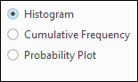
Display mode
Choose a Display mode for the distribution:
- HISTOGRAM Displays a bar chart. The width of each bar is equal to the bin size you set. The height of each bar is proportional to the number of values in each bin.
- CUMULATIVE FREQUENCY An alternative way to visually analyse the statistical distribution is to display a line chart that shows the amount of data less than or equal to the bin value.
- PROBABILITY PLOT From the X axis you can read the probability of observations less than the specific value defined on the Y axis.
These charts count the log normal discarded values (<= 0) as real values, but do not plot them. Histogram chart is not affected by the counted values, as there is no bin in which the values are placed. The cumulative frequency plot is effected where the plot line will start at the frequency to which these invalid values contribute, rather than 0.
Load a Form Set
To display an existing form set in a new chart:
- Click the Forms button at right of the form and choose the form set.
- Click OK to apply the settings to the new chart.
Errors at this point will typically refer to a new chart feature with no equivalent in the old graph. To assist you, the application will highlight the offending form response once you read and dismiss the error message.
To display multiple copies of the same chart:
![]()
Change the Graph Minimum and Maximum
The Histogram function uses the true minimum and maximum for charts whenever the natural log transformation is used. Previous versions used padded values that often reached a minimum of zero, creating very long left-hand histogram tails. The new method avoids the need for manual adjustment.
You may need to recalculate the minimum and maximum graph values to produce a correct histogram from older (earlier version) form sets, but generally only for those incorporating the natural log transformation.
To change the graph minimum/maximum:
- Click the Form button at the far left of the Chart tab.

- Switch to the Graph Limits tab and then click the calculator icons
 at right of the Minimum and Maximum values (don’t click the big Calculate button yet!).
You should not have to change the graph minimum or maximum of existing forms incorporating normally-distributed data.
The histogram is unique because it includes options for setting the graph limits and axes ranges. You use Graph Limits to limit the data used in the chart, and Axis Range to configure the visible axis limits of the graph.
Calculate the Bin Size
We recommend using around 50 bins for any histogram that is intended for statistical decomposition. You can use the Calculate button on the Graph Limits tab to determine the bin size from the number of bins you specify and the graph minimum and maximum values.
To calculate the bin size:
- Ensure the Minimum and Maximum values are correct.
- Click the Calculate button and enter the Number of bins.
- Click OK to apply the calculation, and note the Bin size value.
- Optionally round the bin size to a simpler number.