Spider Graph
![]()
Source
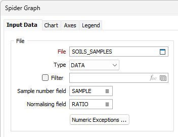
File
On the Input Data tab of the Spider Graph form, double-click (or click on the Select icon) to select the Source file containing your data.
Sample number field
Double-click (or click on the List icon) to select the name of the field containing Sample numbers. The data may be numeric or textual; it will be associated with a colour on the display.
Normalising field
(Optional) Double-click (or click on the List icon) to select the name of a Normalising field.
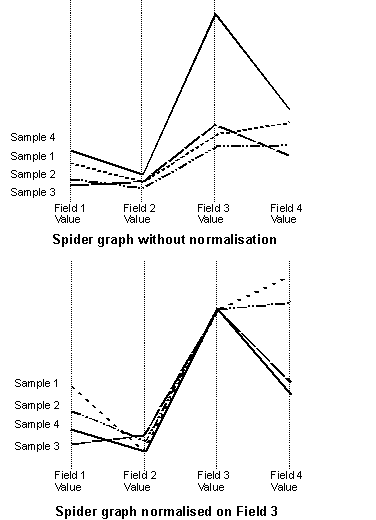
If there are widely different values, you can specify a factor ( a Divisor) by which the values will be divided. You can also normalise values by specifying a field whose values will be used to divide all the others. This makes the value for all samples the same for the normalising field and effectively scales the other field values relative to that field. The following diagram shows the effect of normalisation; different line styles are shown for the different samples here, but on the screen they are identified by colour.
Numeric Exceptions
(Optionally) Use the Numeric Exceptions group to control the way that non-numeric values are handled. Non-numeric values include characters, blanks, and values preceded by a less than sign (<).
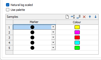
Natural log scaled
Select the Natural log scaled check box to enable lognormal scale for the Spider graph. This will scale the data values and set the Y axis to natural log scaled.
Use palette
Alternatively, select the Use palette check box to apply the palette colours you have selected on the Chart tab.
Samples
Use the grid to specify the number of sample symbols to display in each record group. Use the buttons on the local toolbar to Manage the rows in the list.
The sample points in each group can be denoted by a Marker symbol and a display Colour. A range of standard (Circle, Square, Diamond, Triangle, Pentagon, Hexagon, Star) marker symbols are available for selection in a drop-down list.
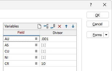
Variables
Use the grid to select the fields to display. For each Field, optionally enter a Divisor (a factor by which the data will be divided before displaying).
OK
When you have set Input options and customised the appearance of the graph, click the OK button to generate the graph.