Chart | Scattergrams
When you run the regression, the data from the X and Y axis fields are displayed in a Scattergram Chart. Information about the chart is also shown in the Properties Pane.
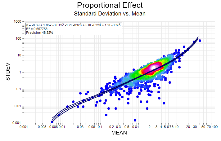
An information summary may also be displayed on the chart itself. This information includes:
- Statistics for each variable such as the mean and standard deviation.
- The coefficients for the equation y = a + bx.
- A correlation coefficient.
- The ratio of the X and Y variances.
When you generate a chart, many of the tools and options on the Chart ribbon are common to most charts. See: Chart Tools
Other tools on the Chart tab are specific to the type of chart displayed. In the Scattergram display:
| Button | Description |
|---|---|
|
|
View the previous group of samples on the Y axis (Down key). |
|
|
View the next group of samples on the Y axis (Up key). |
| Select the field that will be displayed on the Y axis.
|
|
|
|
View the previous group of samples on the X axis (Left key). |
|
|
View the next group of samples on the X axis (Right key). |
| Select the field that will be displayed on the X axis.
|
Whenever you create a report file in a multiple regression (where there is more than one X-axis field), interactively changing the X- or Y-axis field names will append the new combination to the report. This facility provides a way to quickly accumulate the reports corresponding to each X/Y field combination. However, the report file will grow very quickly, so you should avoid using a report file until you have finished exploring your data.