XY Chart
An XY chart is used to determine the relationship between two sets of results, e.g. gold and arsenic.
Although the XY chart is not strictly speaking a QC chart, it is often used as an additional validation tool and is therefore included under the Sample Tracker node for the sake of convenience. However, there is no "in line" equivalent (i.e., the XY chart is currently not accessible as part of the receipt process.)
The XY chart is similar to the other charts; however, the chart display is simplified due to the absence of the confidence monitor and other QC elements. The chart simply displays the values of one combo (X axis) against another (Y axis). To help identify bias, a linear regression line (line of best fit) and a 1:1 line are shown.
Shewhart charts can be opened on their own, based on the parameters selected; or during the processing of a receipt, based on the standards in that lab job.
Chart properties can be set while the chart is open. To access a tab, click the tab label. You can use the handle on the right edge of the Properties pane to increase the width of the pane.

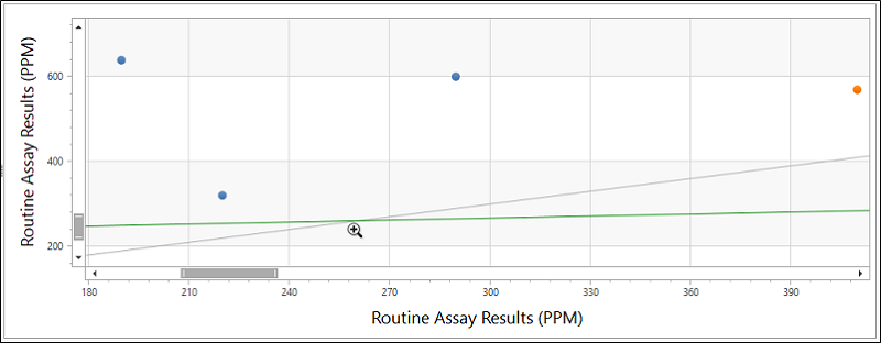
Zoom
With the chart open, you can use the SHIFT + Click shortcut to Zoom In (if not at maximum zoom) on the chart, and the ALT + Click shortcut to Zoom Out (if not at minimum zoom) - as outlined in Shortcut Keys. If you drag the mouse, the drag rectangle becomes the zoom in area (up to maximum zoom). Zoom Out does not support a drag feature.
Filter
Use the Filter tab to select the laboratories and the despatches you want to include on the chart. You can filter by sample type and element combo on the X and Y axes.
The despatches on which the chart is based are listed on the Data tab.
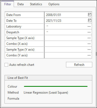
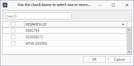
To select samples for the despatch. click on the Despatch ellipsis button.
To select or clear all samples use the check box in the grid header. You can then select/deselect despatches individually.
To switch the order of a column between ascending and descending order, click the arrow icon to the right of the column header.
Select the Auto refresh chart check box option to enable an automatic refresh of the chart whenever the filter parameters are changed. Alternatively, turn off the Auto refresh option and use the Refresh button to only refresh the chart when you choose to.
A legend for the line of best fit is also shown.
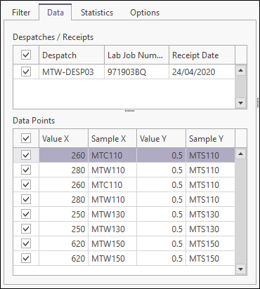
Data
On the Data tab you can select which despatches to include on the chart.
To hide or show columns in the table, right-click on a column header and select Show Column Chooser/Hide Column Chooser from the right-click menu.
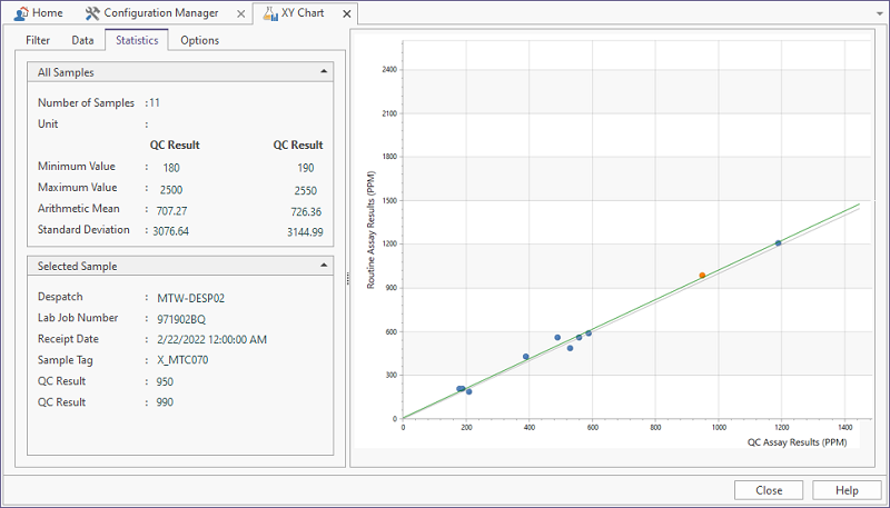
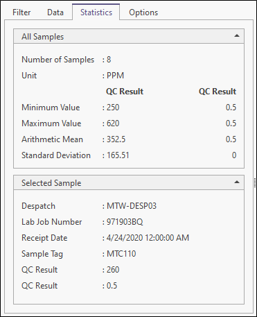
Statistics
Summary statistics and selected sample information are shown on the Statistics tab. You can also select a data point in the chart window to view the details for a selected sample:
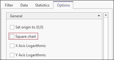
Options
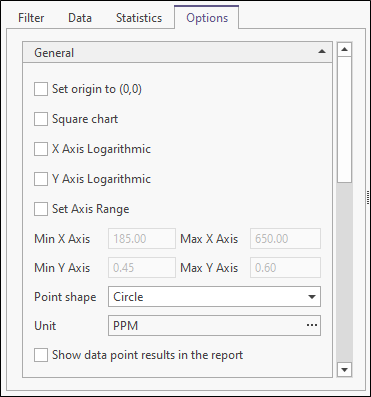
Use the Options tab to customise the appearance and the range and scale of the chart. You can set various options to determine what is shown on the chart and in the QC report. The report is accessed by clicking “Report” on the ribbon menu.

The report uses the Advanced Reporting module. If you have a licence for this module it is possible to create and use a customised version of this report.
Set origin to (0,0)
Select this option to set the origin at the lower left-hand corner. If this option is not set, the origin is calculated automatically based on the underlying data.
Square chart
Select this option to generate a squared chart with the same x and y scale. Setting a square chart for some elements may be obvious and sensible, but might not be so obvious or sensible for elements that have different scales.
The default setting for this option and its visibility are configurable.
If the currently displayed XY Chart does not have the Square chart option enabled, you can toggle the setting on using the button in the ribbon.

X and Y Axis Logarithmic
Select this option to set the X and Y axes of the chart as logarithmic.
The default setting for this option and its visibility are configurable.
Set axis range
Select this option to explicitly set the range of the X and Y axes. If this option is not set, the range is calculated automatically based on the underlying data.
Point shape
Choose how data points are represented on the chart. The default setting for this option and its visibility are configurable.
Unit
Set the unit of measurement for the results data.
Show data point results in the report
Select this option to show data point results in the report. The default setting for this option and its visibility are configurable.
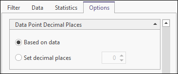
Data point decimal places
By default, decimal precision is based on the underlying data. However, you can explicitly set the number of decimal places for the results data.
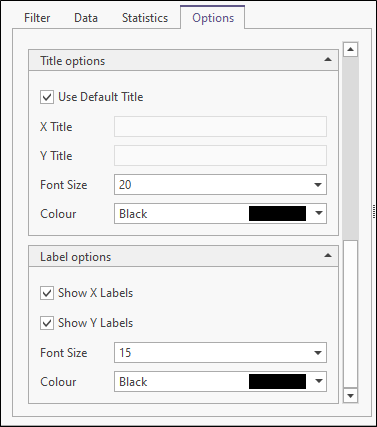
Title Options
Select this option to use a default title for the X and Y axes. If this option is not selected, you can specify a custom X Title and Y Title. Specify the Font characteristics of the title text.
Label Options
Choose whether to Show X labels and Show Y labels along the axes of the chart. Specify the Font characteristics of the label text.