Shewhart Chart
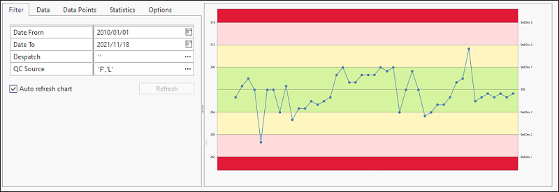
A Shewhart chart plots data points as they relate to the certified nominal value and standard deviation, for an analyte in a specific Standard or Certified Reference Material sample. In Micromine Geobank the Shewhart chart shows two upper and lower standard deviations of the nominal value. The chart is used to detect and measure variations or deviations in the data, and thus provides assurance that the quality control processes in the laboratory are of a high (QA/QC) standard, and thus, other results from the batch/laboratory may be taken as accurate.
The central line represents the actual (nominal) value of the standard for the selected analyte. The reported results for individual samples are plotted relative to "warning" and "action" lines on either side of the true value. First and second warning levels are set at one and two standard deviations respectively, while the action level is set at three standard deviations. Statistically, 95.4% of all measurements should fall within two standard deviations, while 99.7% of all measurements should be within three standard deviations from the true value.
The variation in the measured results for the standards is a good indication of the reliability of the results for the entire batch.
Shewhart charts can be opened on their own, based on the parameters selected; or during the processing of a receipt, based on the standards in that lab job.
Chart properties can be set while the chart is open. To access a tab, click the tab label. You can use the handle on the right edge of the Properties pane to increase the width of the pane.

Zoom
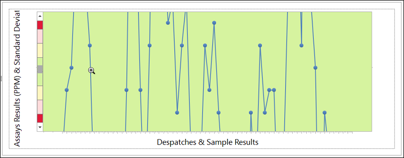
With the chart open, you can use the SHIFT + Click shortcut to Zoom In (if not at maximum zoom) on the chart, and the ALT + Click shortcut to Zoom Out (if not at minimum zoom) - as outlined in Shortcut Keys. If you drag the mouse, the drag rectangle becomes the zoom in area (up to maximum zoom). Zoom Out does not support a drag feature.
Filter
Use the Filter tab to select the laboratories and the despatches you want to include on the chart. You can filter by Date, Standard ID, and Element Combo. Filters are configurable.
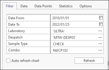
Select the Auto refresh chart check box option to enable an automatic refresh of the chart whenever the filter parameters are changed. Alternatively, turn off the Auto refresh option and use the Refresh button to only refresh the chart when you choose to.
Data
On the Data tab you can select which despatches to include on the chart. A sample count (the number of data points per despatch) is provided.
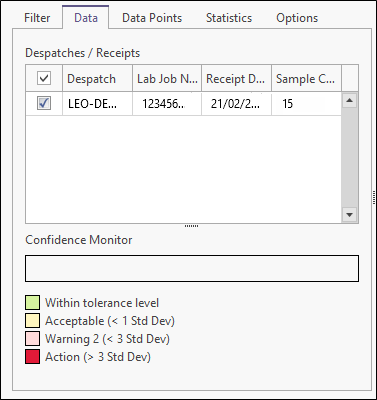
The Confidence Monitor is a visual representation of the spread of data points across the statistical confidence levels. Each "bin" on the bar is colour coded according to the legend shown below. Click on any portion of the monitor to highlight the data points that fall within the corresponding bin.
Alternatively, click on any of the coloured panels in the legend to see the corresponding data points. You can also combine bins by multi-selecting them (i.e. holding down the Ctrl or Shift key while clicking on the individual bins or panels).
The selected points appear as blue squares on the chart.
A low confidence ranking should be given to a receipt with one or more points falling outside the action levels. The number of points outside warning levels should also be considered, while grouping of consecutive readings on either side of the true value may also be an indication of process failure.
Ideally, and when the relevant data is available, the points on a Shewhart chart should be shown in the order that the samples were processed in the laboratory. This offers the best way of detecting temporal variations in the accuracy of the analytical process.
Data Points
The actual data values on which the chart is based are displayed on the Data Points tab. The width of the properties pane can be increased to provide more space for the data list. Click on any item in the list to highlight the corresponding data point on the chart.
Alternatively, click on a data point on the chart to display the corresponding item in the data list. You can multi-select items in the data list by holding down the Ctrl key or Shift key during the selection process.
Data points can be sorted in both the list and the chart by clicking on a column heading; this is particularly useful when viewing results from more than one lab job. By clicking the appropriate button, or right-clicking in the data list, you can choose to show all points in the list, or only the highlighted points.
To hide or show columns in the table, right-click on a column header and select Show Column Chooser/Hide Column Chooser from the right-click menu. See: Hide Columns
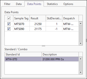
The value used for the nominal value and standard deviation is taken from the original specifications of the standard, as stored in the ST_XS_STANDARD_DETAIL table. This value should be supplied by the laboratory or institution responsible for the preparation of the standard.
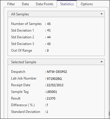
Statistics
Statistics pertaining to the true value and reported values of the standard are shown on the Statistics tab:
Options
Use the Options tab to customise the appearance and the range and scale of the chart. You can set various options to determine what is shown on the chart and in the QC report. The report is accessed by clicking “Report” on the ribbon menu.

The report uses the Advanced Reporting module. If you have a licence for this module it is possible to create and use a customised version of this report.
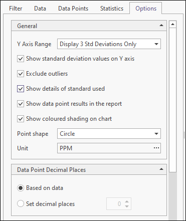
Show standard deviation values on the Y axis
Select this option to show standard deviation values on the Y axis. An even (unlabelled) y axis is used when this option is not selected.
Show details of standard used
Select this option to show the nominal value of the selected sample.
Set axis range
Select this option to explicitly set the range of the X and Y axes. If this option is not set, the range is calculated automatically based on the underlying data.
Show data point results in the report
Select this option to show data point results in the report. The default setting for this option and its visibility are configurable.
Show coloured shading on chart
Select this option to show coloured shading on the chart.
Point shape
Choose how data points are represented on the chart. The default setting for this option and its visibility are configurable.
Unit
Set the unit of measurement for the results data.
Data point decimal places
By default, decimal precision is based on the underlying data. However, you can explicitly set the number of decimal places for the results data.
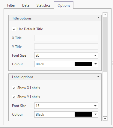
Title Options
Select this option to use a default title for the X and Y axes. If this option is not selected, you can specify a custom X Title and Y Title. Specify the Font characteristics of the title text.
Label Options
Choose whether to Show X labels and Show Y labels along the axes of the chart. Specify the Font characteristics of the label text.