R Chart
The user interface for the R chart is almost identical to the Shewhart chart.
An R chart provides an alternative way of checking the acceptability of a batch of results, especially in cases where the number of standards is insufficient to produce a meaningful Shewhart chart. The R chart shows the absolute value of the difference between the result for the QC sample and the result for the original sample, expressed as a percentage of the larger value.
i.e: Y = abs(Xoriginal - Xqc)/ MaxOf(Xoriginal , Xqc)
Shewhart charts can be opened on their own, based on the parameters selected; or during the processing of a receipt, based on the standards in that lab job.
Chart properties can be set while the chart is open. To access a tab, click the tab label. You can use the handle on the right edge of the Properties pane to increase the width of the pane.

Zoom
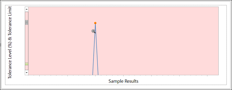
With the chart open, you can use the SHIFT + Click shortcut to Zoom In (if not at maximum zoom) on the chart, and the ALT + Click shortcut to Zoom Out (if not at minimum zoom) - as outlined in Shortcut Keys. If you drag the mouse, the drag rectangle becomes the zoom in area (up to maximum zoom). Zoom Out does not support a drag feature.
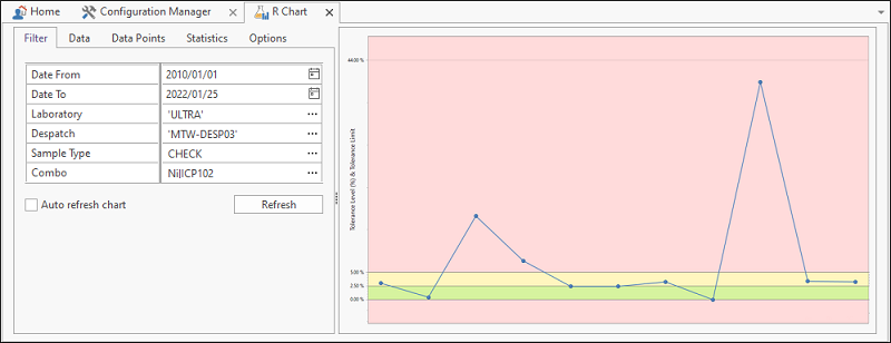
Filter
Use the Filter tab to select the laboratories and the despatches you want to include on the chart. You can filter by Date, Standard ID, and Element Combo. Filters are configurable.
Select the Auto refresh chart check box option to enable an automatic refresh of the chart whenever the filter parameters are changed. Alternatively, turn off the Auto refresh option and use the Refresh button to only refresh the chart when you choose to.
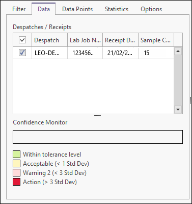
Data
On the Data tab you can select which despatches to include on the chart. A sample count (the number of data points per despatch) is provided.
Data Points
The actual data values on which the chart is based are displayed on the Data Points tab. The width of the properties pane can be increased to provide more space for the data list. Click on any item in the list to highlight the corresponding data point on the chart.
Alternatively, click on a data point on the chart to display the corresponding item in the data list. You can multi-select items in the data list by holding down the Ctrl key or Shift key during the selection process.
Data points can be sorted in both the list and the chart by clicking on a column heading; this is particularly useful when viewing results from more than one lab job. By clicking the appropriate button, or right-clicking in the data list, you can choose to show all points in the list, or only the highlighted points.
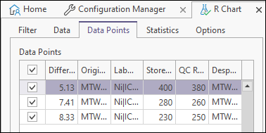
To hide or show columns in the table, right-click on a column header and select Show Column Chooser/Hide Column Chooser from the right-click menu. See: Hide Columns
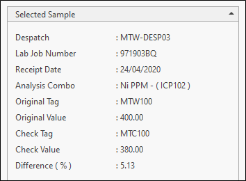
Statistics
Summary statistics and selected sample information are shown on the Statistics tab:
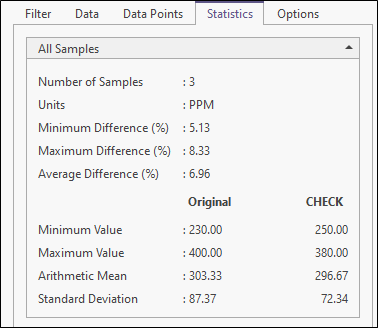
To view the details for a selected sample, select a data point in the chart window.
Options
Use the Options tab to customise the appearance and the range and scale of the chart. You can set various options to determine what is shown on the chart and in the QC report. The report is accessed by clicking “Report” on the ribbon menu.

The report uses the Advanced Reporting module. If you have a licence for this module it is possible to create and use a customised version of this report.
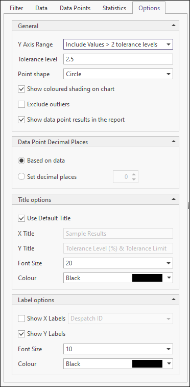
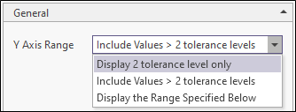
Y axis range
Select an option to explicitly set the range of the Y axis. If no option is selected, the range is calculated automatically based on the underlying data.
Tolerance level
Enter a tolerance level which is the percentage to use for the width of the bands displayed on the chart. This in turn is used to calculate the y-axis range when the Use 2 tolerance levels only option is selected. It is the acceptable tolerance for the differences in the assays of check samples when compared to the assays of the original samples.
Point shape
Choose how data points are represented on the chart. The default setting for this option and its visibility are configurable.
Show coloured shading on chart
Select this option to show coloured shading on the chart.
Exclude outliers
Select this option to exclude outliers from the results.
If we assume that the dataset has a normal distribution, statistically, 95.4% of all measurements should fall within two standard deviations, while 99.7% of all measurements should be within three standard deviations from the true value. In a dataset with 1000 points, we would therefore expect three points to be outside three standard deviations
If these outliers are included in the calculation, they can skew the result.
Show data point results in the report
Select this option to show data point results in the report. The default setting for this option and its visibility are configurable.
Data point decimal places
By default, decimal precision is based on the underlying data. However, you can explicitly set the number of decimal places for the results data.
The differences for individual sample pairs are plotted relative to "tolerance" levels, based on the global tolerance value.
Ideally, the tolerance level for the R chart should be based on information supplied by the laboratory. However, since these tolerance figures are usually linked to various value ranges for each method/element combination, the amount of metadata required to produce accurate statistics could be very large; therefore Sample Tracker follows the more simple approach of using a global tolerance value.
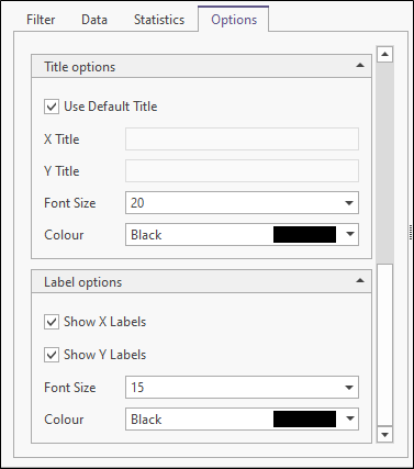
Title Options
Select this option to use a default title for the X and Y axes. If this option is not selected, you can specify a custom X Title and Y Title. Specify the Font characteristics of the title text.
Label Options
Choose whether to Show X labels and Show Y labels along the axes of the chart. Specify the Font characteristics of the label text.