Create Graphs
In this example you will be using the Graph tab in the Data Browser to display a stacked bar graph which displays the status of each unit of equipment. You will add a pie graph to the display to show the relative availability of each unit.
You will be using an Equipment Availability report.
Do the following:
- Click on Reporting
 .
. - Click Performance and Availability | Equipment Availability in the report types list. The definition pane opens.
- Select the following definitions:
Object Attribute Selected Value Site SiteA Period Shift Production Day Shift Thursday September 16, 2010 Equipment Unit Load12, Load13,Load14, Truck57, Truck58, Truck59 RosterCrew All - Select the following Summary Level:
Summary Level Value Period Shift Equipment Unit - Click Run Job. The Report will be displayed in Report View.
- In Report View, select Data Browser from the format types on the menu bar.
- Above the column headers are three tabs - Data, Graph and Custom. These represent three ways that your data can be displayed. The Graph tab presents the data in a graphical format, while the Custom tab to used to display material flow and stockpile reports.
- Click the Graph tab. On the header of this window are the following options:
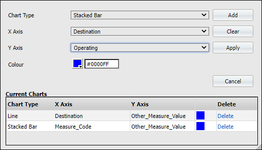
- Configure
 . Define the chart type, the axes and colour.
 - Zoom in and Zoom out.Select the percentage amount.
- Configure
- Click Configure .
- Set the following:
Option Selected Value Chart Type Stacked Bar X Axis Equipment Y Axis Operating Colour xxxx
This is the colour that will define the Operating status.
- Click Add. The definition determines the Operating states that appear in the Current Charts window.
- To add another state for Equipment, select the following:
Option Selected Value Y Axis Down Colour xxxx
This is the colour that will define the Down status.
- Click Add. This definition will be added to the Current Charts window.
- To add another state for Equipment, select the following:
Option Selected Value Y Axis Idle Colour xxxx
This is the colour that will define the Idle status.
- Click Add.
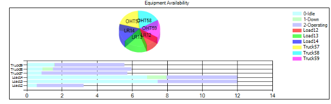
- Click Apply to display the graph. You will see a horizontal bar with three colours that define the three states—Operating, Down and Idle. This graph displays All of the equipment (see the X axis), so only one horizontal bar is displayed.
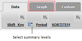
- To see a summary of the status for each piece of equipment you need to change the attribute summary level for equipment. Click the Data tab.
- On the Equipment column, click the plus sign +. The attribute summary levels will change to the level defined when the report was generated - i.e. Equipment = Unit. The Equipment column will display the units of equipment, Load12, Load13, Load14, Truck57, Truck58, Truck59.
- Click the Graph tab. Now you can see that the X axis is displaying all of the selected pieces of equipment.
- You are going to add a pie chart on the same graph to display the relative availability of each piece of equipment. Click Configure.
- Make sure that the Current Charts window displays your previous selection of Operating, Down and Idle. Select the following:
- Click Add. The colours for this pie chart are selected by default.
- Click Apply. You have a pie chart above the stacked bars that summarises the availability of each piece of equipment. The stacked bars show the number of hours each piece of equipment was in either of the Operating, Down or Idle states.
- Click Close to close Report View.
Remember, the plus sign + on some of the column signifies that the column is grouped by summary levels. You can use the plus sign + to present the data either at the highest or broadest summary level (All), or at the summary level defined when the report was generated.
| Option | Selected Value |
|---|---|
| Chart Type | Pie |
| X Axis | Equipment |
| Y Axis | Availability |
| Colour | xxxx |