Statistics
This
Gaussian Anamorphosis Modelling
![]()
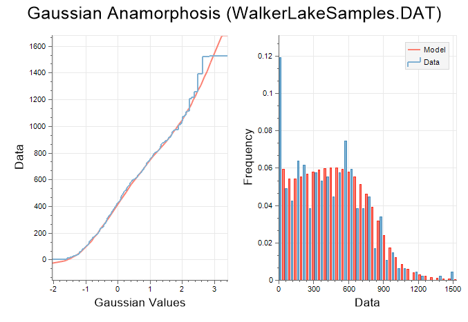
The left-hand view displays the Gaussian values of the input data, along with the fit of the polynomial function. The right-hand side of the chart displays the histograms of the model (red) and raw data (blue).
Micromine uses Hermite polynomials to create a piecewise polynomial function that matches the raw data distribution. Use the spin control near the top of the chart to adjust the number of Hermite polynomials within the range of 1 and 200. However, because each increment adds complexity, you should aim for the smallest number of Hermite polynomials that fit the data.
Once you are satisfied with the fit of the polynomial, you can use the Gaussian data field like any normal variable.
If you make any changes to the Gaussian data field during Gaussian Anamorphosis Modelling, you must back-calculate it into real-world values. To do so, on the Stats tab, in the Transformation group, select Gaussian Anamorphosis | Back Calculation and supply the Gaussian data and Gaussian model, along with a name for the back-transformed data.
![]()
Cell Declustering
![]()
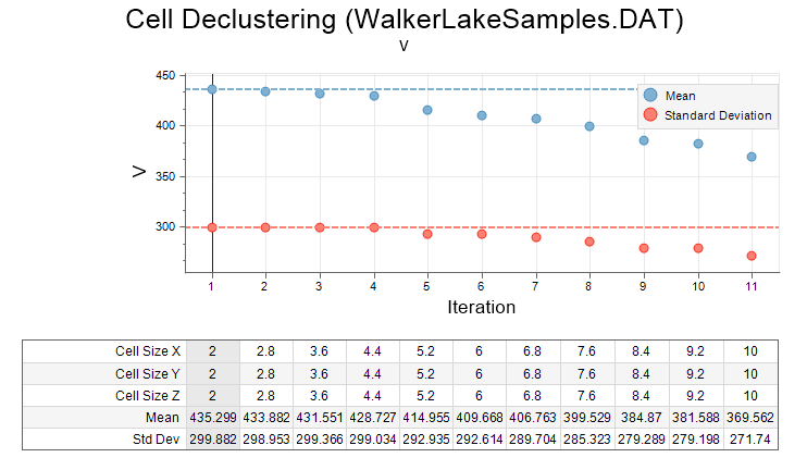
A typical mineral deposit is sampled in such a way that high grades or potential ore are sampled more densely than low or unmineralised grades. This over-sampling of high grades is called clustering. If a simple mean of these grades is calculated, the high grades will overwhelm the average value and produce a result that is too high.
Declustering is used to minimise this high-grade bias. It relies on the assumption that clustered samples, being close together, are somewhat correlated and may include some redundancy. Because of this redundancy, the clustered grades must be allocated lower weights than their un-clustered neighbours. Once this is done, a weighted average is calculated instead, which is known as a declustered mean.
PCA
![]()
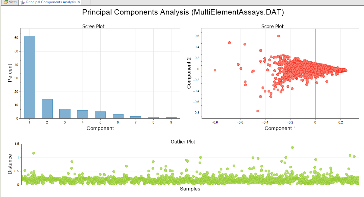
Principal Components Analysis reduces the dimensionality of multivariate data by looking for correlation amongst the input variables; two strongly correlated variables can easily be simplified to a single variable with minimal lost of information. When this takes place in a large multivariate data set, the overall dimensionality can be significantly reduced.
Keep in mind that the larger the data set, the longer the analysis will take to run. The transformed values are written to the input file using the field naming convention "PCA Value #".
The Graph will depend on the type of plot chosen on the Plots tab of the form. In this example, a Scree Plot, a PCA > Score Plot, and an Outlier Plot have been selected for inclusion:
Co-variograms
Co-kriging is now supported for the Variogram Map and Variograms functions on the Stats tab, in the Variography group.
Co-kriging requires a model of spatial continuity that accounts for the continuity of the primary variable and secondary variable(s). The interaction between them is expressed as a cross-covariance. This requires both direct and cross semivariograms to be calculated and modelled.
H-Scattergrams
Significant memory and performance improvements have been made to the H-Scattergrams function on the Stats tab, in the Variography group.
![]()
In the H-Scattergram display, the pairs are now binned into a gridded layout. This allows large data sets to be used without having an adverse impact on memory usage.
On the Display tab, a Point Size value can now be entered, and a new Point Scaling option is provided. If this option is selected, each point scales with the amount of pairs binned into it. Smaller points are drawn in front of the larger points.
Cross Validation Charts
On the Stats tab, in the Variography group, Cross Validation now includes True vs. Estimate, Standard Error, and Standard Error vs. Estimate charts for assessing the cross-validation result.
You can also select an option to display the chart in Multi-graph rather than Single graph mode.
![]()
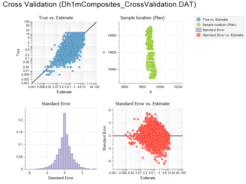
Mean, Variance, Standard Deviation, Minimum and Maximum stats are shown in the Properties Pane for the raw data and the estimated data. Count and Correlation Coefficient values are also shown.
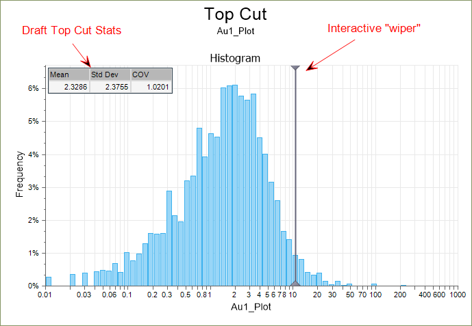
Top Cut Chart
A new Show draft top cut stats option on the Display tab of the Top Cut form, can be set to show (Mean, Std Dev, and COV) stats of the data that has been top cut using the draft top cut, on each graph.
The stats on each graph will change dynamically as the wiper is adjusted:
Co-kriging
QKNA, Search Neighbourhood Stats, and Cross Validation functions now support Co-kriging. Co-kriging requires a model of spatial continuity that accounts for the continuity of the primary variable and secondary variable(s). The interaction between them is expressed as a cross-covariance. This requires both direct and cross semivariograms to be calculated and modelled.
Search Neighbourhood Stats
An option to Use a Variable Search Trend is now available on the Interpolation Method tab of the Search Neighbourhood Stats form when the chosen method is IDW or Kriging.
The structural trend file you select, is an output of the Create Trend function on the Block Model tab, in the Unfold Trend group.
Histogram (Multivariate)
The Histogram (Multivariate) function on the Stats tab, in the Exploratory Data Analysis group, now supports the selection of multiple input files.
You can also choose which variables to include or exclude from the chart using selection check boxes on each row of the Variables grid list.