Chart
Create a Simple XY Scattergram Chart
- Create a new blank report or load an existing report.
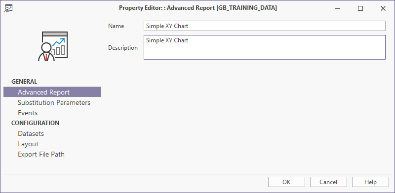
- Select Advanced Report and fill in the Name and Description details for the chart.
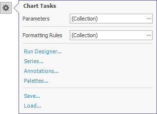
If you are editing an existing chart, you can manually start the chart designer by clicking the smart tag and selecting Run Designer...
- Select Data Sets and view the SQL Script Properties that determines what data is available for the chart.
- Select Layout and click on the Launch Designer icon to bring up the Report Designer.
- In the Report Designer, drag and drop the Chart control from the Standard Controls Toolbox tab onto the Detail band. The chart designer appears.
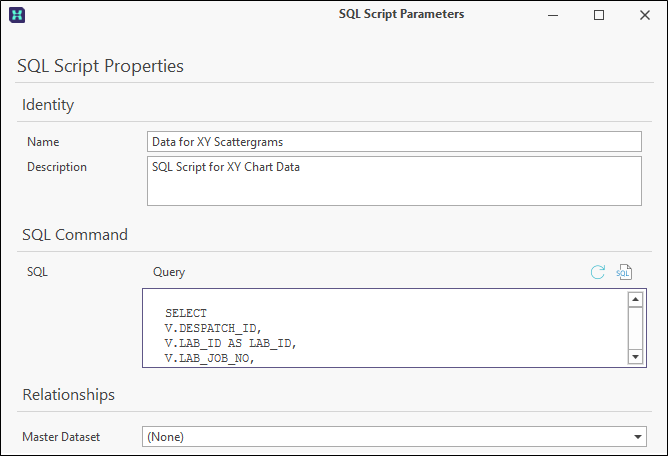
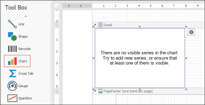
Chart Designer.
-
Configure the Appearance, Palette and Back Colour options in the Options tab on the right to determine the colour settings for the graph.

The Appearance drop-down is used to set the use of the colour palette for the chart. The drop-down will display a preview of the appearance option.

The Palette drop-down is used to select the colour palette to be used for the chart.

The Back Colour option is used to set the background colour for the chart display, if required.

If you select the Auto Layout check box, the layout options for the chart will be automatically configured.
The Properties tab contains options to configure behaviour, data and other elements for the chart.
The Appearance section of the tab is used to configure the look and format of the chart.

The Behaviour section of the Properties tab controls the Cache to Memory setting for the chart, as well as the content and format of the text that appears when the chart is empty and when it is displayed too small.

The Data section of the Properties tab displays the Series Template details for the chart.

A Series Data Member can be selected from the drop-down, but in this case will be added to the chart series we will create.
Other sections in the tab control the Elements, Layout and Miscellaneous configuration for the chart.

The Data tab contains a drop-down to select the data source for the chart. In this example, we have selected the QAQC SubRep XY data source. Data members for the chart can be selected for the chart when the series is created.

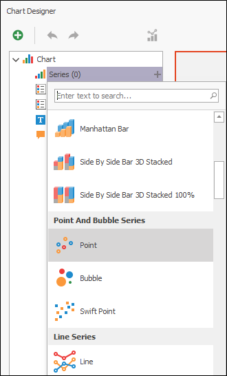
- In the left-hand panel, click the + sign for the Series option in the left panel under Chart.
- Select Point from the available chart types.
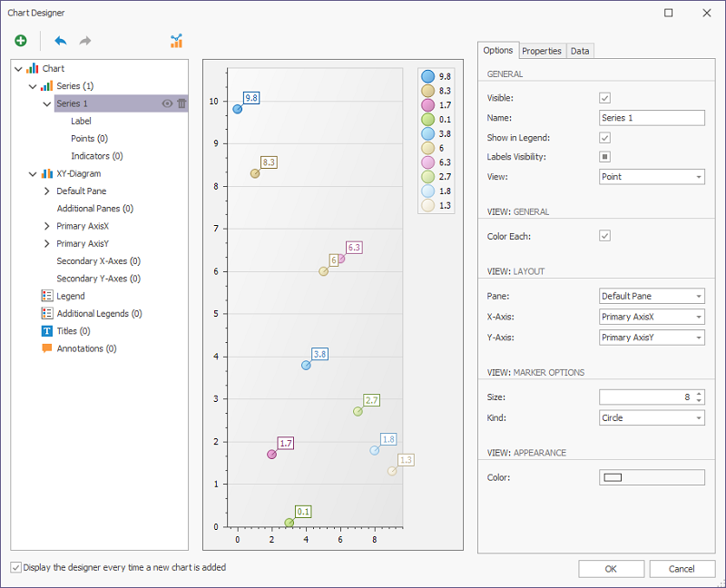
The Point graph is displayed in the Chart Designer. The chart can be configured using the panel at the right.
- Use the Name: field in the Options tab of the panel at the right to name the data series. For example, the simple XY diagram series can be called Routine vs. Checks.
- Make sure the chart is set to Visible using the check box. Other options for Layout, Marker Options and Appearance views can be left defaulted, or you can customise the look of your chart.

The Properties tab contains options to configure behaviour, data and other elements for the chart.

In the Behaviour section of the tab, you can configure the scale, legend and sorting options for the chart. The options for our example are set as follows:

The Data section is used to configure the data members for the chart. For this example, the options are configured as follows.

-
Set the Argument Data Member to PARENT_CALC_RESULT using the drop-down.
-
Set Value Data Members to QC_CALC_RESULT.
-
Click the ellipse at the right of the Filter String field to open the FilterString Editor.
-
Create your required filter string using the editor, or use the example as follows:

The Data tab of the right-hand panel contains the datasource and available members for the chart. The Argument, Value and Colour cells at the bottom of the panel are populated with the information entered using the Properties tab.

You can change the details by dragging and dropping members on the corresponding cell if required, as outlined in the panel.
Using the panel at the left of the Chart Designer, you can add Indicators, such as an Exponential Moving Average, to be displayed on the chart.
-
Click the + sign at the right of the Indicators label and select the desired indicator from the list.

The indicator is displayed in the chart, and can be configured using the Options tab in the panel at the right.
You can use the left-hand panel to configure the Primary and Secondary Axes as well as add Panes, Legends, Titles and Annotations to the chart.

You can also add elements to the chart using the Add Chart Element button at the top left corner of the Chart Designer.

When you have added any required elements to the chart, the Chart Designer preview is updated to reflect the changes.

Click OK to place the chart in the Report Designer.