Bar Chart
Report Design
The first consideration when creating a report is visualising the output. This helps to determine the elements that will be required. For example, in the case of displaying the depths of drillholes, the objective is to create a chart for the drillholes in a particular Project.
-
From a data point of view, this would require the Project, Site ID and End Depth information.
-
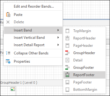
From a layout point of view, the chart wants to show the data for all drill holes combined, not a graph for each drill hole. This can be achieved by placing the chart in a Group Header.
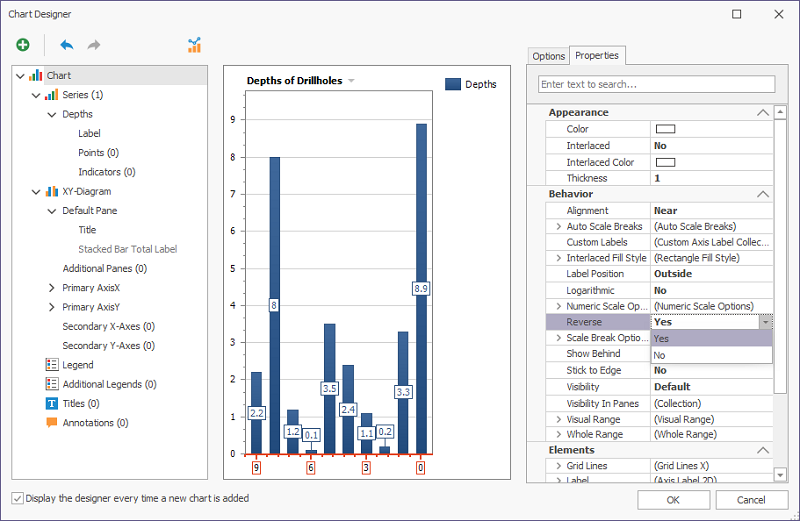
Visually, a simple Bar Chart would suffice. Being the depths of drill holes though, it would look slightly different from normal bar charts; starting the Y axis at the top of the window. This option can be configured, as shown in Insert a Simple Bar Chart.
Insert a Simple Bar Chart
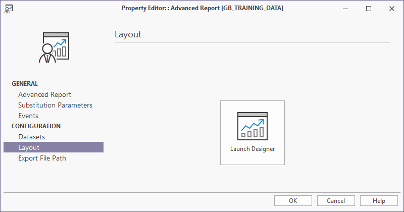
- Create a new blank report or load an existing report.
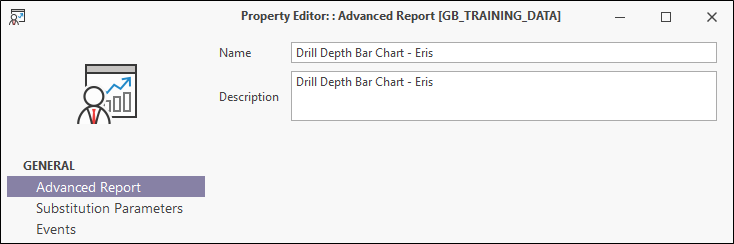
- Select Advanced Report and fill in the Name and Description details for the chart.
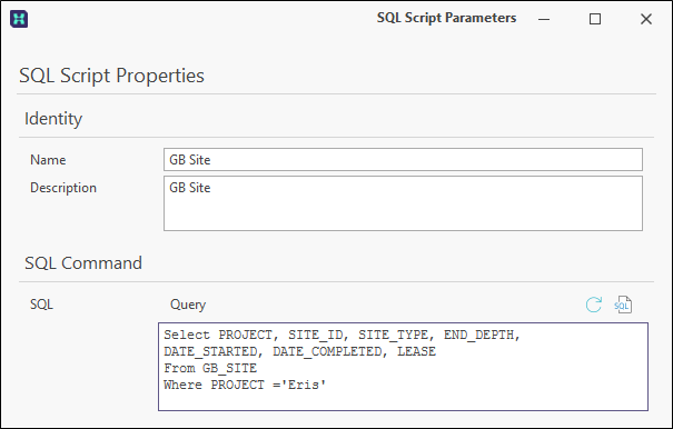
- Select Data Sets and enter the SQL Script Properties that determines what is available for the chart.
- Select Layout and click on the Launch Designer icon to bring up the Report Designer screen.
- To insert Layout and click on the Launch Designer icon to bring up the Report Designer screen.
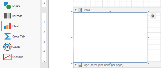
- In the Report Designer, drag and drop the Chart control from the Button Bar tab onto the Detail band.
-
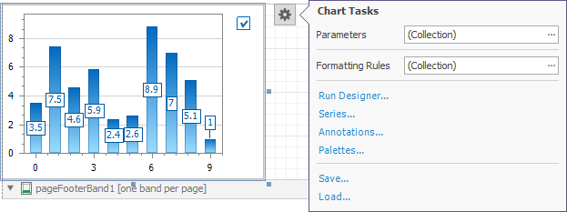
The Chart Designer appears.
If you are editing an existing chart, you can manually start the Chart Designer by clicking the smart tag to open Chart Tasks and select Run Designer.
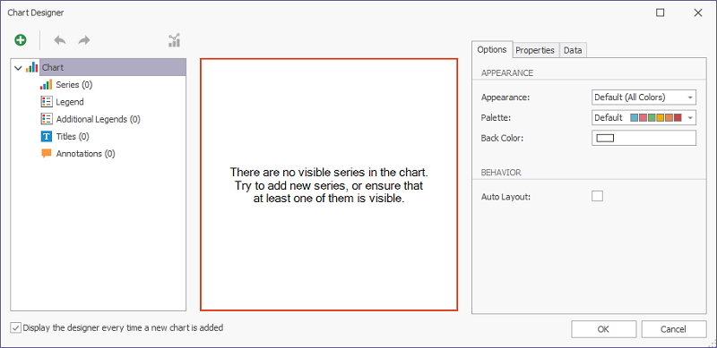
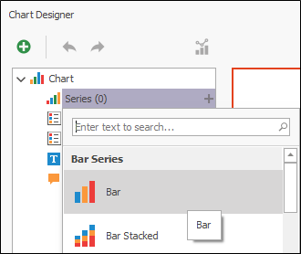
Set up the Chart.
- Select Bar from the available chart types.
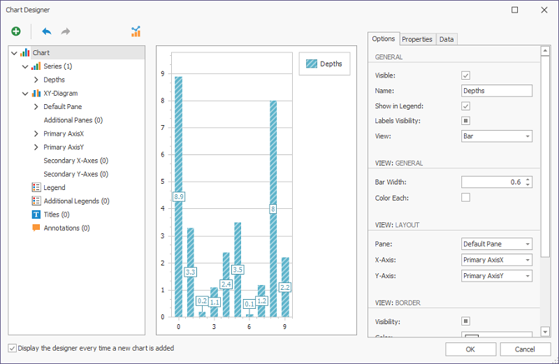
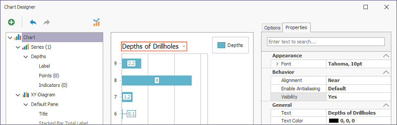
- The Chart Designer will display a bar chart. It is advisable to name your objects, so change the Name to Depths. Also check Show in Legend as shown.
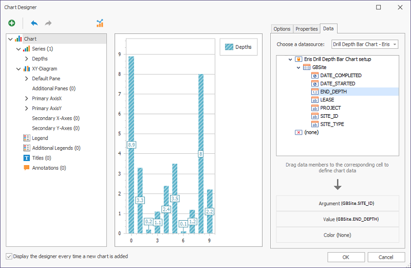
- Click on the Data tab. Select your datasource if that has not auto-populated. Under GBSite, drag SITE_ID onto the Argument box below and then drag END_DEPTH onto the Value box.
Customise the Chart's Presentation
The Chart Designer provides many options to customise layout. Clicking on an item in the left-hand panel, will have two effects: a red box will appear around the selected item in the middle panel and the right-hand panel will show parameter settings relevant to the item.
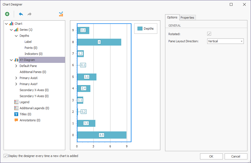
- For instance, to show the chart with the horizontal bars, rather than vertical, click on the XY-Diagram item in the left-hand panel. In the right-hand panel, select the Rotated check box. The chart is rotated by 90 degrees to make the bars horizontal. This does not fit with the design plan, so uncheck it again to return to vertical.
- Click on Title on the right, then set General - Text to an appropriate title for the chart. Also check Alignment is Center and Visibility is Yes.
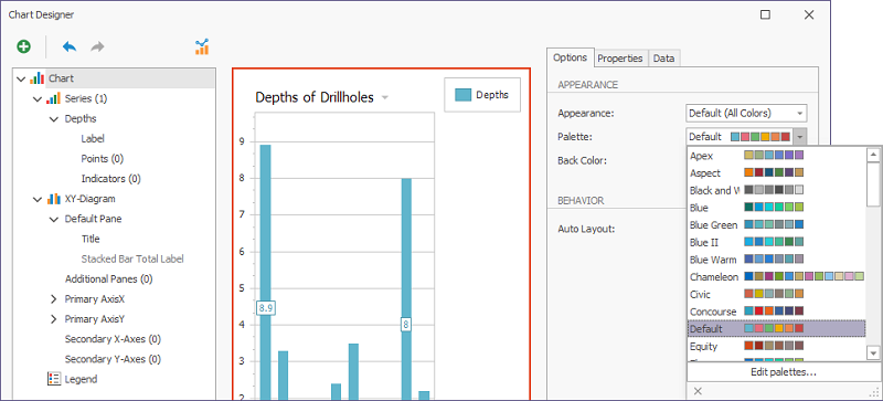
- To change the chart colours, click on Chart at the top in the left-hand panel. On the right under Options, explore Appearance and Palette. In the example, they have been left on Default.
- There are a large number of variables that can be changed to Visible with the check box checked.
- Add labels for the X and Y axis. To do this, first click on the Axes object, then click on the X axis. Click on the Elements tab and fill in the properties as shown below:
- Change the Primary axis using the drop-down list. Fill in the properties as shown below:
-
Close the Report Designer, then click OK on the Property Editor: Advanced Report to save your changes.
NOTE: This is how to save Advanced Reports.
It is possible to easily customise many other properties to improve the readability and usefulness of the chart. Try it and see!
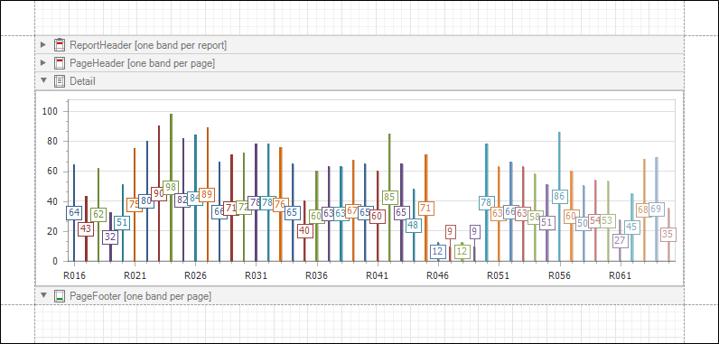
Get the Result
The final result, with the chart embedded in the Detail Band, is shown below: