Designer Elements
The Report Designer is used for creating and editing reports.
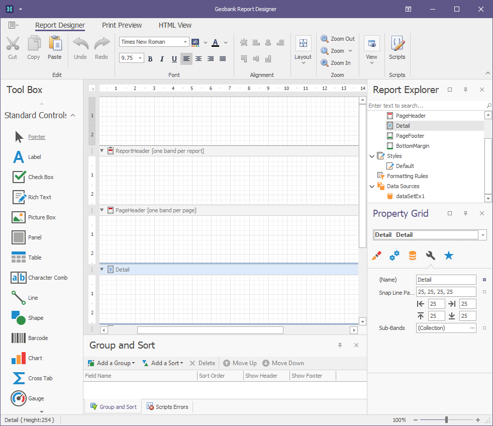
The following table lists the main interface elements of the Report Designer. Starting locations have been given for each element but all except Design Panel and Status Bar can be moved around, pinned, unpinned, floated or closed. If you lose a window, in the Ribbon under View, the Windows button gives you a list of the controllable windows.
| Element | Description |
| Ribbon Control | Top Represents the main toolbar in the Designer that unites the Main, Formatting, Layout and Zoom toolbars, as well as the Scripts tab button. |
| Design Panel | Centre This is the Designer's main element, as it represents a surface where a report is being edited and previewed. The Designer provides a multi-document interface and can have as many Design Panels as required, each associated with a single report instance. |
| Button Bar / Toolbox | Left Allows you to add controls to a report by dragging onto a report area. |
| Report Explorer Panel | Right upper Represents the visual tree of a report. It shows a report's structure in a tree form and makes navigation through the report easy. |
| Field List Panel | Shared with Report Explorer Shows the structure of a report's Datasets and is used to bind report controls to data. |
| Property Grid Panel | Right lower Used to access and modify properties of a report and all its elements (bands and controls). |
| Group and Sort Panel | Bottom Allows you to quickly perform grouping and sorting operations throughout a report and visually represents the report's grouping structure. |
| Scripts Error Panel | Shared with Group and Sort When errors are found in a report's scripts (after clicking Validate in the Scripts tab), lists these errors. Clicking an error opens the corresponding script section in the Scripts tab. |
| Status Bar | Extreme bottom Provides tips and specific information about the Designer element being hovered by a cursor, or an action being currently performed by an end-user. |