Ribbon
The Ribbon above the Design Sheet provides the tools and options you need to show or hide panes in the Form Designer window, navigate and manipulate the controls you have added to the form, and finally save and execute the form.
Note that the ribbon layout is dynamic. To save space, when the Form Designer is moved as an undocked floating window and resized, smaller buttons are used in place of larger ones:
The smaller the Form Designer window, the greater the occurrence of small buttons:

The ribbon is split into Form, Edit, Alignment, Size, Layout, Zoom, View, and Designer groups. These are described below:
Form
Use the options in the Form group to run, rename or save the form.
Run
Click the Run button to preview the current form to view the design in a preview window. The form is fully functional. When the form is executed by the user, it is shown in a tabbed Micromine Geobank window.

Save
Click the Save button to save the changes you have made to the form. You can also select an option to save the form under a different name using Save As. If you have finished editing the form, select Save and Close.
Rename
To edit the name and the description of the form currently open, click the Rename button:
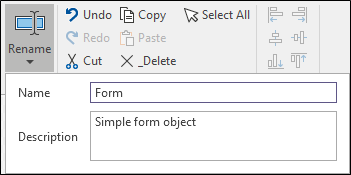
Note: If you have copy and pasted a form in the Configuration Manager, you will need to open the form before you can rename it.
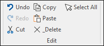
Edit
Use the options in the Edit group to Select All controls, Copy, Cut and Paste selected controls, Undo and Redo your edits.
Alignment
When more than one control is selected, use the options in the Alignment group on the ribbon to adjust their (Left, Right, Centre, Middle, Top, Bottom) alignment.
The control that is selected first becomes the Master control, to which the other selected controls are aligned.

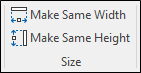
Size
When more than one control is selected, use the options in the Size group on the ribbon to adjust their width or height to match the Master control. The Master control is the control that you selected first.
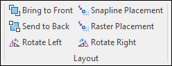
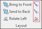
Layout
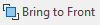
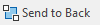
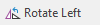
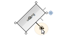
When one or more controls are selected, use the options in the Layout group to adjust the layer order or rotate the controls selected in the Design Sheet. You can also set placement options:
When you add a control, it is placed on its own layer. Each time you add a new control, it is placed on the top layer with the previous controls on layers beneath it. If necessary, you can move controls back and forth in the layer order. This may be necessary when a control, for example a filled rectangle, is obscuring the controls beneath it.
|
Click Bring to Front to move the currently selected control(s) to the front of the layer order. |
|
Click Send to Back to move the currently selected control(s) to the back of the layer order. |
| You can also move incrementally through the layer order using Forward and Back options on the right-click menu. | |
|
Click the Rotate Left button to rotate the selected controls 90° in that direction. |
|
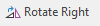
Click the Rotate Right button to rotate the selected controls 90° in that direction. |
|
|
|
|
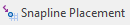
When Snapline Placement mode is enabled, snaplines are shown, allowing you to snap to other objects on the canvas as the control is moved. |
|
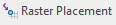
When Raster Placement mode is enabled, you can snap to a 5 by 5 grid of pixels. |
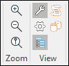
Zoom
The following navigation tools are provided on the ribbon (and on a toolbar below the Design Sheet).
|
|
Zoom In on the canvas. |
|
|
Zoom Out on the canvas. |
|
|
Zoom to the Actual Size of the form. |


A Zoom to Fit option is available on the toolbar below the canvas.
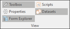
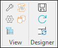
View
Use the options in the View group to toggle the display of the following panes on and off:

|
The Toolbox pane contains a list of the container and user interface controls that can be dragged and dropped onto the Design Sheet. |

|
The Properties pane allows the properties of the selected control (or the shared properties of multiple controls) to be viewed and edited. |
|
The Form Explorer |

|
The Scripts pane allows you to modify the underlying scripts that control the behaviour of the controls you have added to a form. |

|
The Datasets pane shows the tables and fields you have defined for the form. The tables can be shown as a list or a hierarchy. You can hide or show the pane using a toggle button on the ribbon. Fields or tables in the Datasets pane can be dragged and dropped directly onto the Design Sheet:
Use the ALT key after the drag and before the drop to place the control in a "container".
Select the fields required in the sequence in which they should be displayed.
This adds controls bound to the data with labels in the layout below:
|


Designer
Use the options in the Designer group to save the layout of the panels and panes in the Form Designer.

|
Save the current layout. |

|
Restore the current layout to its saved state and undo any layout changes. |

|
Reset the current layout to the application's default layout. |
Version
The Object Version field can be set by the designer to a two-part version number (x.y) in order to easily track iterations of a Form's development and distribution.
