Grid Columns, Rows and Spans
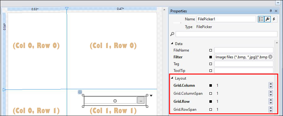
All forms use a grid as their primary container. Additional grids may also be nested within this primary container or within other containers. For this reason, all controls have GridColumn, GridRow, GridColumnSpan and GridRowSpan settings which define their cell position within the grid.
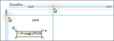
By default, the Grid comprises one row and one column, however additional rows and columns may be added. This can be achieved interactively by clicking in the (blue) spans on the top edge and the left-hand edge of the grid.
When you click in the column span or the row span, a column or a row boundary (blue) guideline is added which divides the grid into cells:
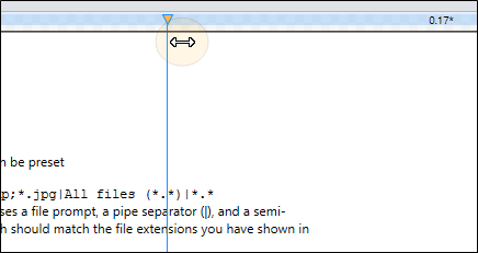
You can adjust the width and height of the columns and rows by clicking and dragging the handles of the guidelines with the mouse:
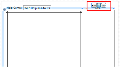
Toolbar settings on the span control of the grid allow the height and width of the rows and columns to be:
- Expressed as an absolute measure in pixels (Fixed)
- Calculated as a weighted proportion of the full size of the grid (*)
- Calculated automatically depending on the content (Auto)
The GridColumnSpan and the GridRowSpan properties can be used to position a control across column and row boundaries.
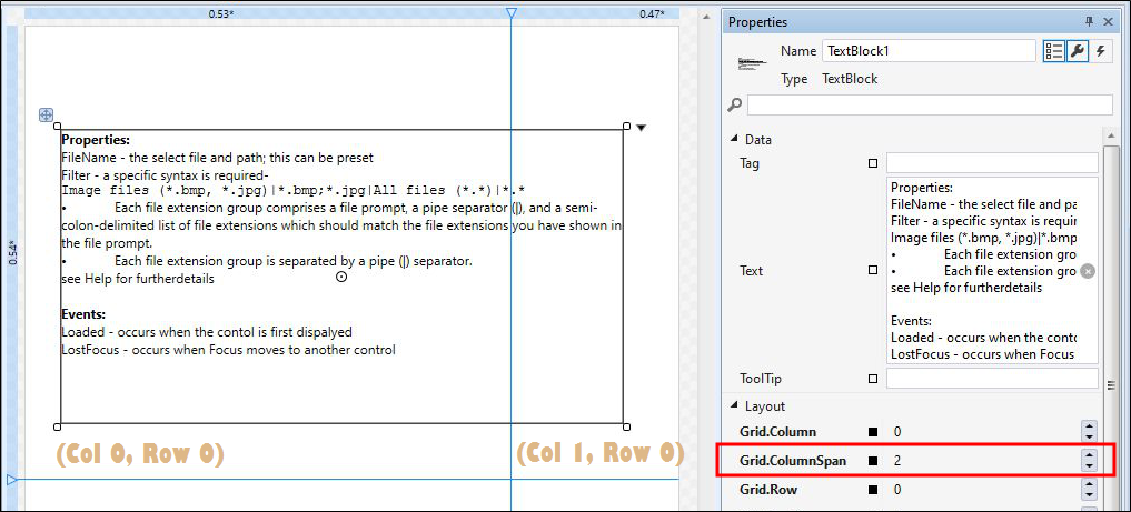
At runtime, this has the effect of merging the cells spanned by the control.
Note that the margin and alignment properties you set for a control are relative to the cells spanned by that control.
Grid Definitions
You can click Undo on the ribbon (or the right-click menu) to remove a column or row guideline you have inadvertently added.
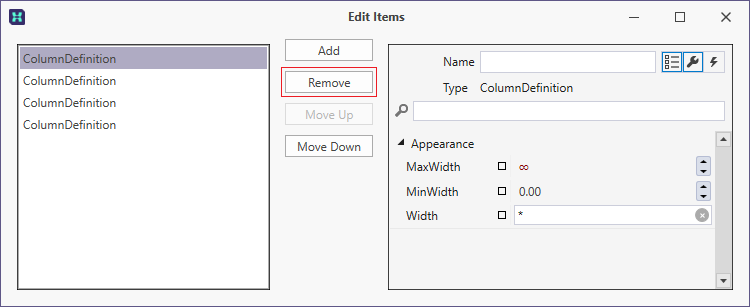
Alternatively, you can edit the ColumnDefinitions or the RowDefinitions of the grid by clicking the ellipsis button to the right of those properties in the Properties pane:
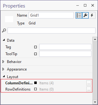
When a grid is nested (inside a grid or another container) the GridColumn, GridRow, GridColumnSpan and GridRowSpan settings of the grid are exposed in the Properties pane: