Chrono Reports
Chrono reports are the static reports with the data, organized in columns and in rows. These reports are used to create static report tables to match business standard templates. Chrono reports allow the user to create tables with a mix of data (digger tonnes, crusher grades, truck hours, drill meters), and to visualize the data in charts.

Sample Chrono Summary Report
Add a Chrono Report

A "New Chrono" report will appear in the list of reports. Left click on the report and rename it as required.
By default, an empty report will be displayed with the Table Setup and Charts Setup tabs available. Populating data into them correctly will unlock the Table and Charts tabs.

Available and locked tabs of a new Chrono Report
The Workspace
The Chrono Reports workspace comprises four main tabs with different functionality, as described in the sections below.
Table Setup tab
The Table Setup tab is used to create the table structure and data rows. Open it to edit the newly created report.
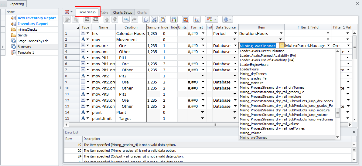
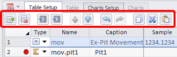
Report rows can be added, removed, indented, moved up/down, copied, cut, pasted using the top toolbar.
-
When creating repetitive reports (i.e. Pit1, Pit2, Pit3, ...), start by creating a table template. Once complete, highlight the rows and select the Copy icon. Paste the copied rows and use the Find and Replace function to update the references.
-
Use Change Time Settings button to set reporting intervals and start/end periods. You may choose to report by "Scheduling Periods", "Number and Name", "Calendar Years", "Financial Years", "Calendar Quarters" etc. For the Start and End periods you may select certain periods dates or schedule start/end to display in your report.

Change Time Settings button and Reporting Intervals menu
Set the values in each column to match your data set. Description of the columns see in the table below.
| Column | Function |
|---|---|
|
Type |
Set row type to “Title”, “Row” or “Iter”.
|
|
Name |
An alphanumeric identifier used to create a unique lookup for the row, which can later be referenced in graph series and calculated fields. It is also used as a lookup code for formulas and charts. |
|
Caption |
The display name of the row in the output table. |
|
Indent |
Creates nested table fields. Indentation of child rows under title rows. |
|
Hide |
Optionally hide a field from the output table. |
|
Units |
Optionally specify units (meters, bcm, tonnes). |
|
Format |
Excel-style number formatting. |
|
Initial |
Optionally set the opening value for cumulative sums of this field. |
|
Data Source |
Choose a data source from a list or create a calculated field. |
|
Item |
The Item column requires a Data Source to be specified.
|
|
Filter 1 Field |
Filter field for filtering results. |
|
Filter 1 Value |
Filter value to apply to the filter field. |
-
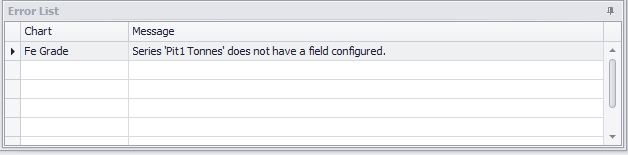
A red circle on the left of the Type column indicates that you have made some mistakes filling up a table or there are some unresolved issues. Check the Error List below to get a description and fix all the errors listed.

Example of table errors and their description in the Error List panel
Other toolbar buttons
|
Button |
Icon |
Description |
|---|---|---|
|
Find and Replace |
|
<CTRL>+ H. Use this icon to quickly update a range of selected cells when editing or updating reports |
|
Convert to Static Report |
|
Convert your report to static. Note that if your report currently has errors, they must be resolved before the report can be converted to a static one. See the Errors list below. |
|
Manage Custom Lists |
|
Opens Custom Lists dialog where you may configure custom lists grouping different items into custom categories. Custom lists allow selection of different fields and you can also access them in the calculated fields.
|
|
Formatting |
|
Use this button to:
|
|
Usage Hints |
|
Applicable hotkeys you may use when working with a report.
|


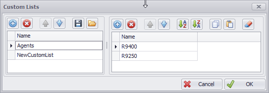

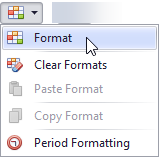

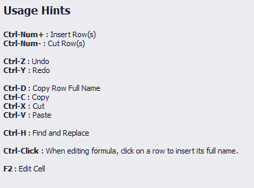
Table tab
Once you resolve all the issues listed in the Error List the Table tab becomes available. Open it to see the final report.

Table tab example
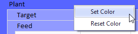
|
Right click on any field header to set or reset a color |
|
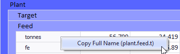
|
Right click on any field row to copy its full name |
|
Charts Setup tab
Chrono Charts require a valid Chrono Report to work.
Note: If changes are made to the model or report that cause errors in the Chrono Report, the charts will become unavailable.
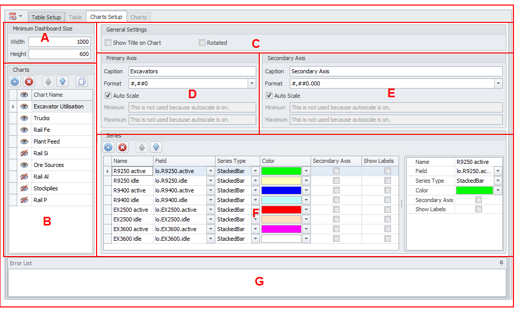
The Charts Setup tab comprises the following areas, as described below:
-
Minimum Dashboard Size – The minimum size a chart can have before the Charts tab will add scroll bars to view all visible charts.
-
Charts – This area is used to manage the charts associated with the Chrono Report. Use the buttons on the local toolbar to manage the list of charts:
|
|
Add a new item to the list. |
|
|
Remove the currently selected item in the list. |
|
|
Move the currently selected item Up to reorder the list. |
|
|
Move the currently selected item Down to reorder the list. |
|
|
Copy the currently selected item and add it to the list. |
![]() Use the Show icon to set what charts will be visible in the Charts tab.
Use the Show icon to set what charts will be visible in the Charts tab.
-
General Settings - Select the check box to Show a Title on the Chart. The Chart Name is added to the chart.
Rotated – By default all charts have time plotted on the X-Axis. Selecting the Rotated check box option will show time plotted on the Y-Axis instead.
-
Primary Axis
| Caption | The name displayed for the primary axis. |
| Format | Select a number format for the primary axis. |
| Auto Scale | If selected, Min/Max for the chart will be automatically adjusted based on the data displayed. |
| Min/Max | Min/Max can be manually adjusted to override the Auto Scale. |
-
Secondary Axis
Inputs function the same as Primary Axis (see above).
-
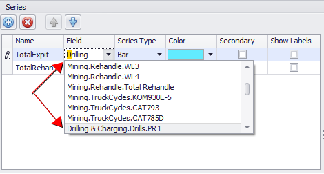
Series - Use the buttons on the local toolbar to add, delete or reorder the series.
Note: If a chart has overlapping components, the lowest series on the list will appear over the top of all other series in the chart.
| Name | The Series name which is displayed in the legend. |
| Field | The Field name within the ChronoReport. |
| Series Type | These chart type options change how the data will be displayed. |
|
A Search facility is provided when selecting from the Field (or the Series Type) drop-down. Type a search string to locate the field (or the series type) you want:
|
|
| Color | Choose a color to represent each series. |
| Secondary Axis | Select this check box to display data on the secondary axis. |
| Show Labels | Select this check box to display data labels data at each period.. |
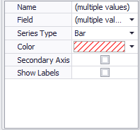
If multiple series are selected, use the right-hand side of the Series pane to bulk update inputs:
-
Errors - Any issues with the chart setup are indicated here.
Charts Tab
Review all data you populated in the previous tab by opening the Charts tab.
Note that this tab is only available if there are no errors remaining in the Chart Setup tab.
You may always come back to the Charts Setup tab to change the Series Type to display in charts.

Charts tab example overview
Setup Tips
Filter Wildcards
Below are example wildcards which could be used to filter the data by parcels:
| Available filters | |
|---|---|
| hg | Returns only "hg" parcels. |
| hg? |
Returns "hg" plus exactly one trailing character, i.e. hg1, hg2, hg3 *Note "hg" would be excluded in this filter, because it only has two characters. |
| hg* | Returns "hg" plus any number of trailing characters, i.e. hg, hg1, hga, hg171101 |
| hg|bg | Returns "hg" and "bg" parcels. |
| !hg|!bg | Returns all parcels excepting "hg" and "bg". |
Calculated Fields
Calculated fields use a formula to reference the Name field of other rows.
| Chrono Report Formulas | |
|---|---|
| V(“field”) | Looks up the row with the name “field” and returns the value. |
| V(“field”) * 10 / 3 | Looks up the row with the name “field”, multiples the value by 10, and divides by 3. |
| S(“title.*”) | Looks up all children of the row named “title”, and returns the sum. |
| CV(“field”) | Returns the cumulative value of the row named “field”. The initial value is set in the “Initial” column of the “field” row. |
| SD(1, V(“field”)) | Returns 1 divided by the value in the row named “field”. If the denominator is zero, it returns zero. |
| Math.Round(V(“field”)) | Return the row named “field”, rounded to the nearest integer. |
| Math.Ceiling(V(“field”)) | Return the row named “field”, rounded up. |
| Math.Floor(V(“field”)) | Return the row named “field”, rounded down. |
| Math.Log(V(“field”)) | Returns the natural logarithm of the row named “field”. |
| V("myValue") > 0 ? 1 : 0 | If "myValue" is greater than zero, return one, otherwise return zero. |
If the formula has been incorrect previously, and you make a change to correct it, it won't turn black straight away. Switching to the Chart Setup tab and then switching back will resolve this.